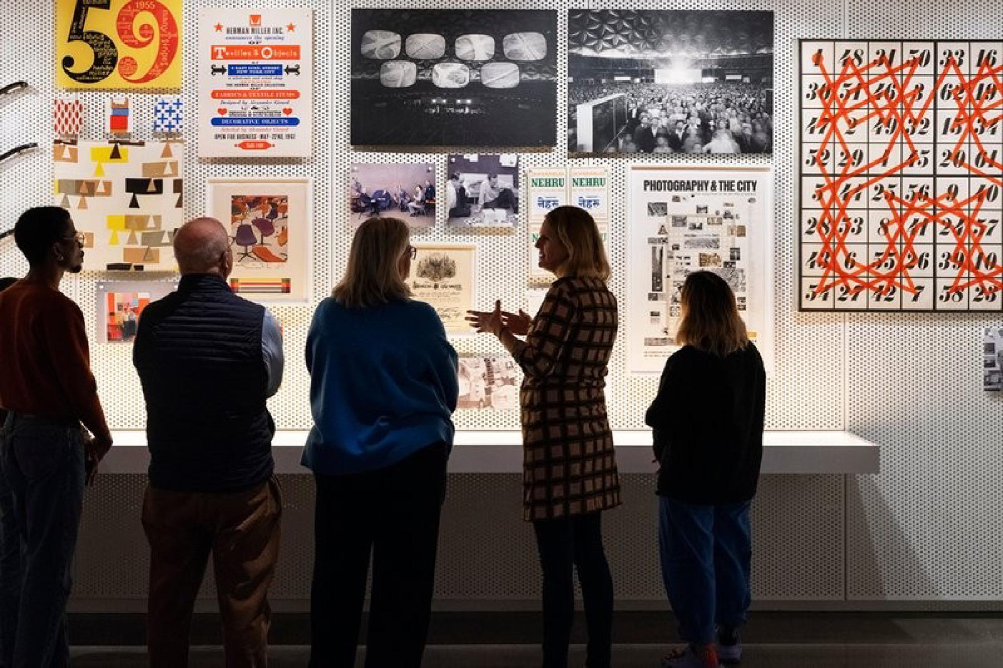
The Eames Institute of Infinite Curiosity opened its Archives and collection to the public for the first time in March 2024. To prepare for this, I led the Digital Product team in creating a holistic user journey, guiding our audience from initial awareness through ticket purchase and post-visit engagement.
Why Are We Here? #
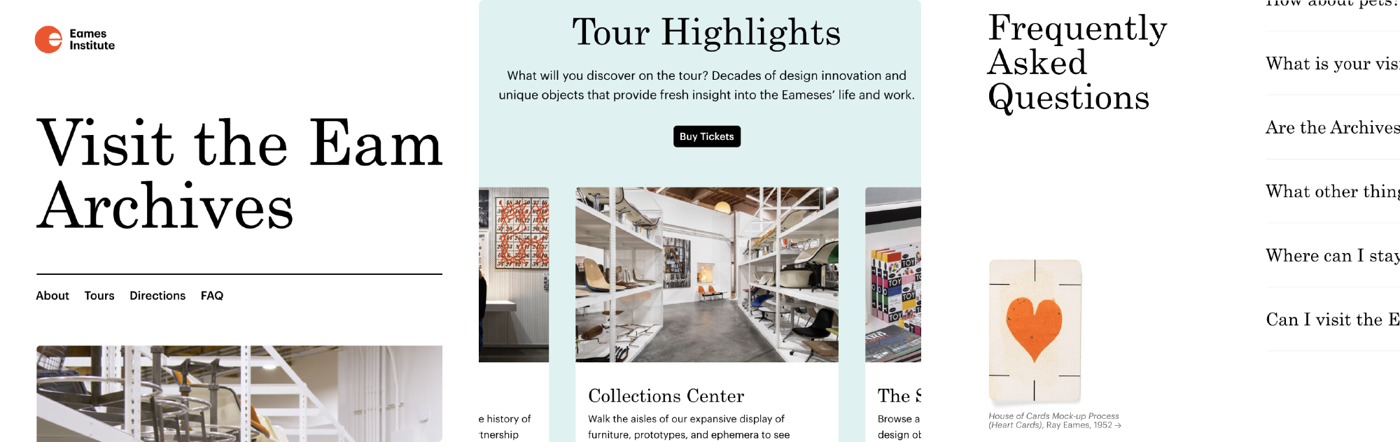
Many times, a product and platform can be useful forcing functions to rapidly coalesce around a shared execution strategy. With the Archives, we used the Visit page to hone in key business decisions such as pricing, frequency, and positioning.
As part of the project kick off, we also aligned on several goals and antigoals:
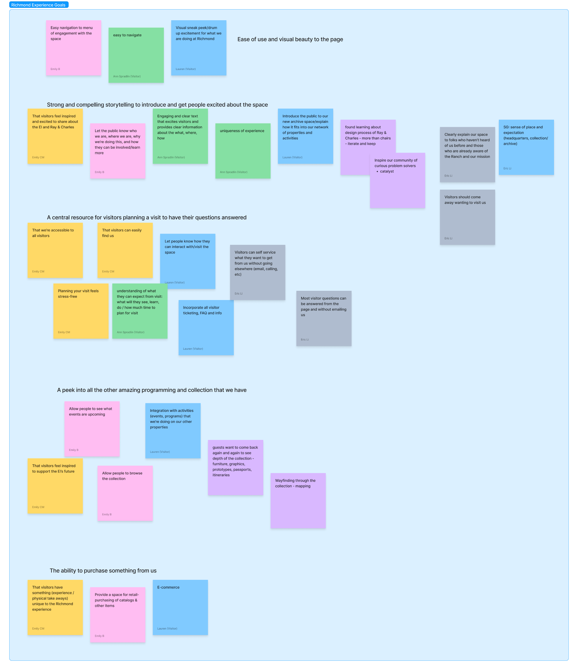
Goals
- Ease of use and visual beauty to the page
- Strong and compelling storytelling to introduce and get people excited about the space
- A central resource for visitors planning a visit to have their questions answered
- A peek into all the other amazing programming and collection that we have
- The ability to purchase something from us
Antigoal
- Replicating features and functionality of other parts of the site (e.g. collection, future eComm)
By mapping out our goals through affinity mapping, we were able to create internal alignment of key feature requirements.
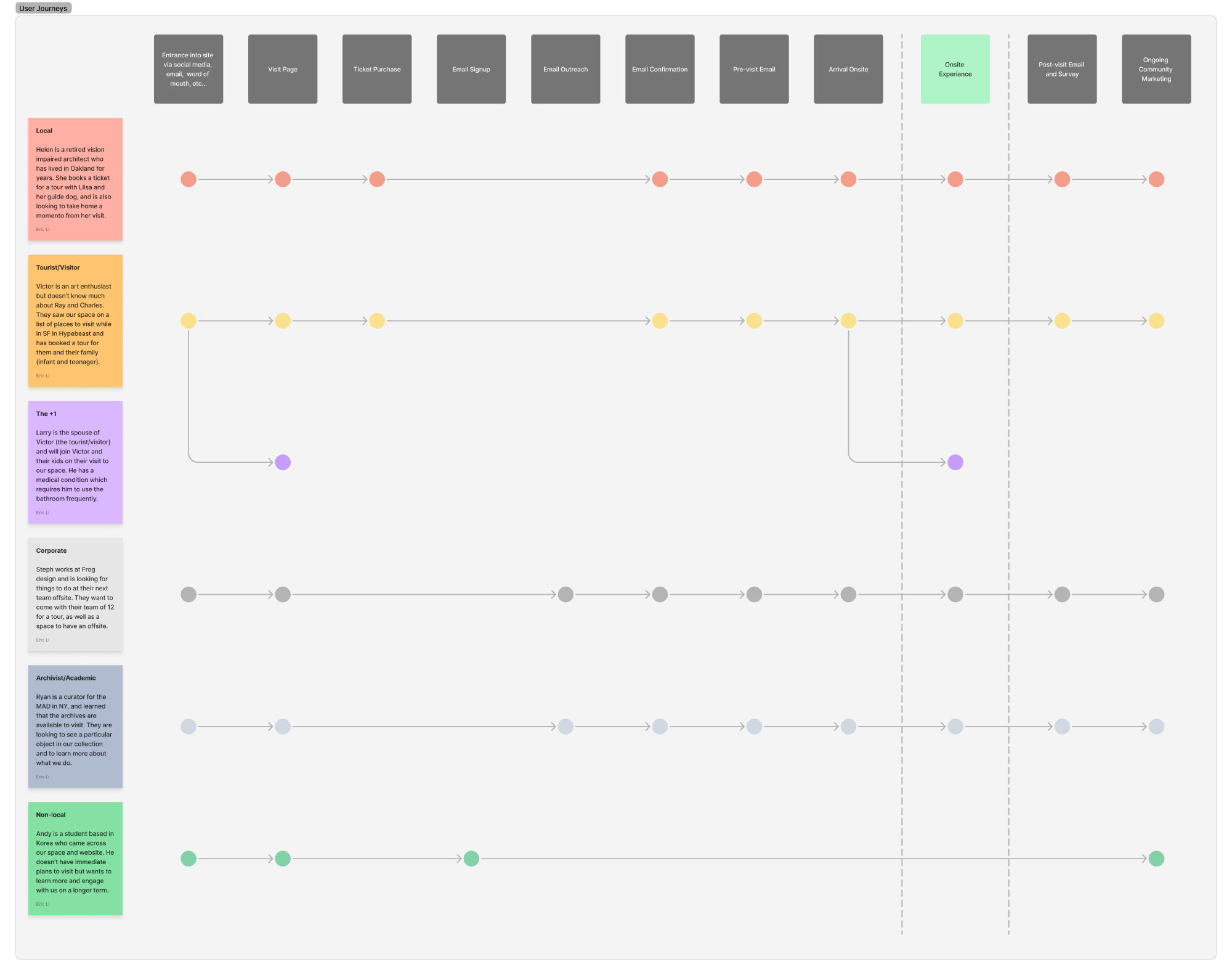
The Archives was created for a diverse set of audience members from all over the world.
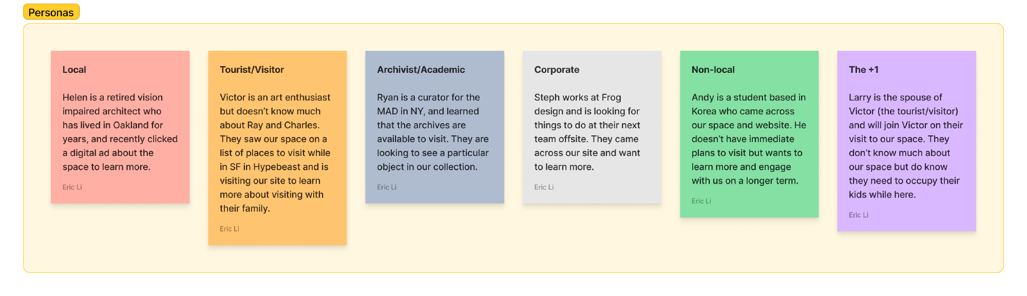
Thinking For Someone Else #
I also proposed several personas for leadership to align on core functionality and features for launch, which was only several months away. We introduced a few more in our workshop. This process allowed us make aligned and informed decisions for our future audience.
- Local
- Tourist/Visitor
- Archivist/Academic
- Corporate
- Non-local
- The +1
A collaborative set of personas helped us ensure we were always building for our audience and not for ourselves.
What Does Our Audience Actually Want? #
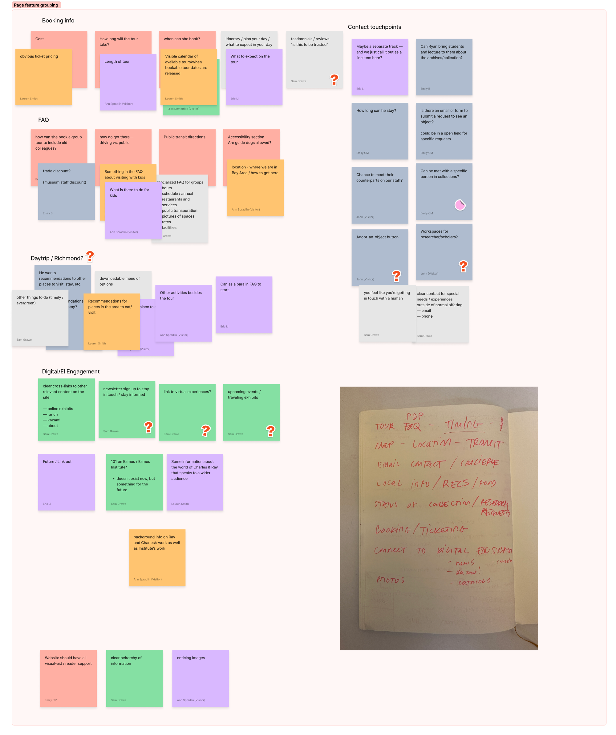
I facilitated an exercise based on these personas in which the participants mapped out:
- What are the tasks that each user might need to complete?
- What information would be useful for them?
Through an affinity mapping process, this output was consolidated into several broad categories that we felt all personas required in order for the digital experience to be a success.
- Booking Info
- FAQ
- What to do in the area
- Ongoing digital engagement
- Contact touchpoints
There was a lot of overlap across the personas, allowing us to prioritize feature and copy based on audience needs.
Through another round with a smaller group, we arrived on a final information architecture for the experience. By aligning on the IA first, we could then hone our focus on visual and user experience design with a clear scope and list of requirements.
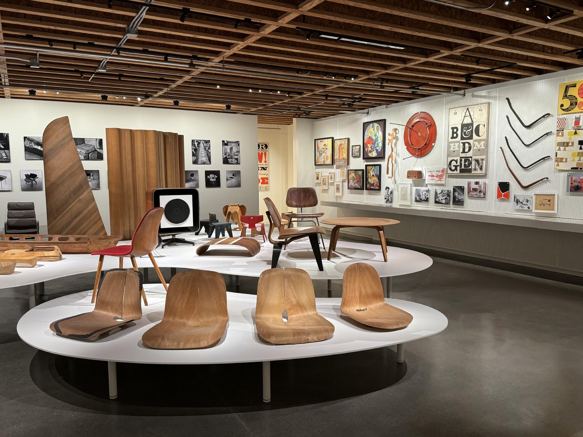
The height of the user journey centered around the visitor’s onsite tour of the Archives.
Going Beyond Digital #
It was important to reframe this project as treating the entire audience experience holistically, and to unify the following experiences into one journey. As these touchpoints were largely based on internal mediums and responsibilities, we needed to understand where overlaps existed:
- Marketing
- Digital Experience
- Onsite Experience
I encouraged us to focus on end to end user journey mapping, which centered around our audience’s experience in person.
In an workshop where we reviewed the journey, I led our discussion on how copy and visuals could be unified across all touchpoints for our audience members. This allowed us to ensure consistent naming and voice across all touchpoints.
Understanding What to Charge #
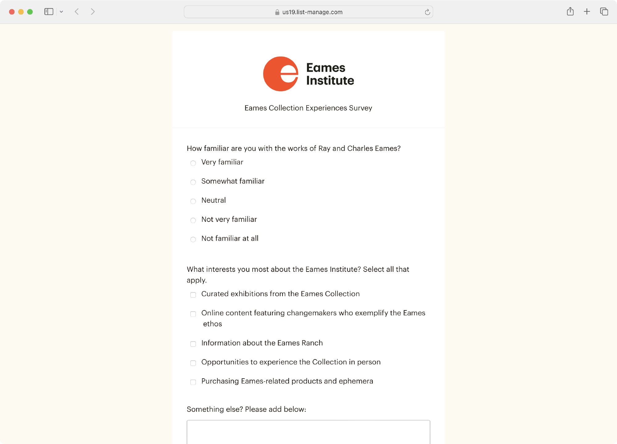
As we progressed into design and build, certain strategic business decisions around cost and framing became blockers. I helped our partners identify these blockers and leveraged an survey of our subscribers so we could make informed decisions.
- Goal: Aid decision-making concerning Richmond tours and ticketing structure by surveying our online community
- Methodology: A 14-question survey was sent to 538 of our most engaged community members via Mailchimp
- Audience: “Most engaged” was determined by any subscriber who opened any of our last 5 campaigns, minus internal staff
- Results 79 survey results, 15% response rate
I encouraged us to focus on end to end user journey mapping, which centered around our audience’s experience in person.
We discovered that not only was our audience willing to pay for tours, they were willing to pay more for tours with Llisa, our Chief Curator and the youngest granddaughter of Ray and Charles Eames.
This research allowed us to make sound business decisions around the tour experience and calculate expected P&L based on different factors.
One thing that became clear through this process was a need to define several crucial aspects of the tour. As is often the case, a design can be a forcing function for business decisions.
The Power of Emails #
After leading a thorough research and evaluation of our ticketing vendor, I settled on TicketTailor. This vendor had incredible support (arguably the most important aspect to a B2B vendor), and fit the current needs of our organization.
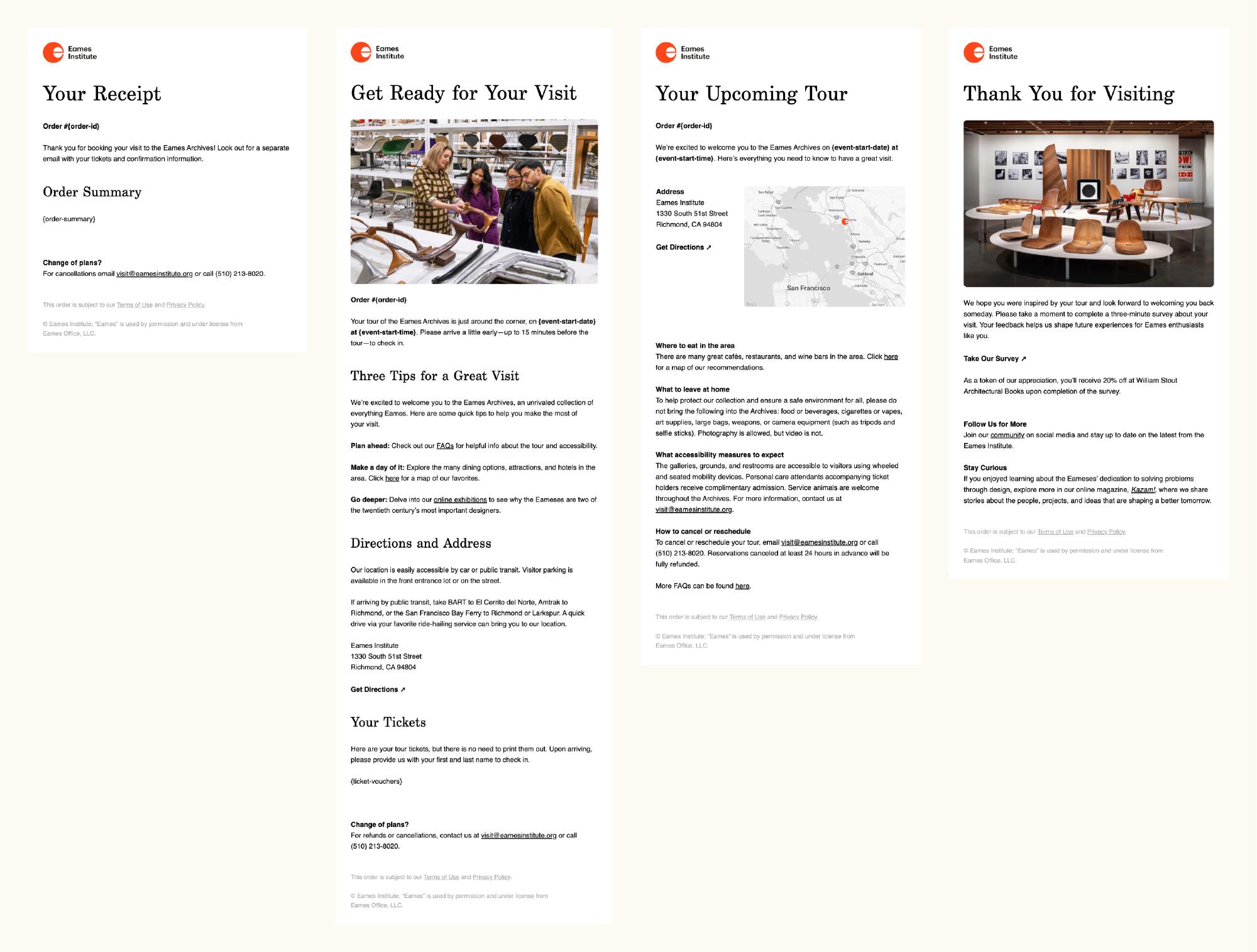
An added bonus was the ability to accept Apple/Google Pay, and to have fully customizable emails. Given how significant email is to any modern customer journey, I led an email workshop to ensure we nailed down the contents of each part of our transactional email journey. I captured the essence of each email into a short phrase to help guide copy and creative efforts.
Receipt
“Get excited!”
Confirmation/Pre-visit Email
“Here’s what you need to know”
Reminder email (-48 hrs)
“Any thoughts?”
Post-visit (+6 hrs)
These were then designed into a series of four thoughtful emails, integrating holistic copy and creative strategy with the onsite and digital experience.
I viewed these emails as an important extension of our digital experience.
A More Eamesian Design System #
A few interface details. To quote Charles Eames, “The details are not the details. They make the design”
We introduced significant evolutions to our design system which ranged from visual evolutions to new features. In short, the digital experience introduced:
- More direct CTAs and visual focal points through cards
- Distinct section areas through the introduction of horizontal rules and more distinct color blocking, inspired by the 1973 Eames book A Computer Perspective
- Collection artifact details for visitors to be immersed into other parts of the site
- In page navigation and quick links for faster access
A Personal Touch #
One aspect we consistently prioritized throughout this project was ensuring as many personal touch points as possible. This meant adding small adjustments such as customer specific data and order information, as well as introducing steps into our process to make the experience feel as personal as possible.
A welcoming order confirmation message, with helpful information specific to the customer’s order
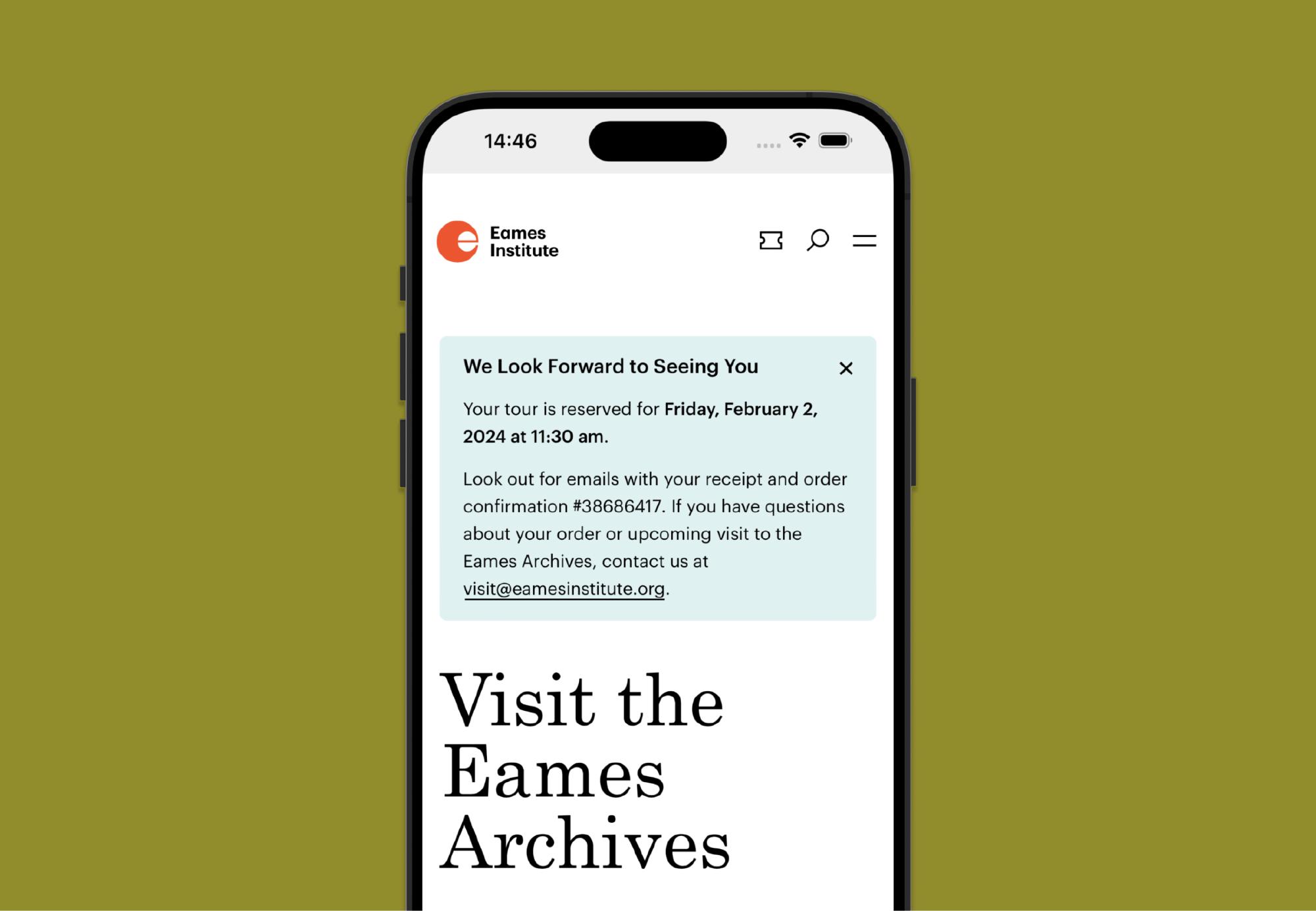
Upon order success, we returned our customer back to our website. There, they were greeted with a subtle order confirmation card. By showing this, we wanted to accomplish two things:
- Successful order completion, and opportunity to explore further on the website
- The beginning of a new relationship with the Eames Institute
Coupled with this confirmation card was also an email receipt and additional messaging getting people excited for their upcoming tour.