MoMA’s collection pages are often seen as canonicals record of their topics, often appearing in the top search result for the artist or art term. In 2021, our content and education teams worked with us to explore ways to spruce up our existing artist and art term pages, as well as increase discoverability.
Using data gathered from user feedback and surveys, I led a redesign of our artist and art term collection pages. Our goal was to make the individual pages more dynamic and open, providing users with more ways to learn beyond just text. We also revisited our index pages for these sections, adding features for discoverability and surfacing new content. As part of this pass, we also did a visual design pass to bring this experience in line with our new brand expression.
User research #
Since we had a limited time allocated to our collection sprint, I wanted to make sure that what we focused on addressed adding features that would be significant quality of life improvements for our users. To do so, I used Hotjar to insert user surveys on our artist and art term pages. By collecting data ahead of our inception, we could make better use of our time focusing on core areas.
In the survey, I asked users whether they were able to find what they were looking for, as well as what sorts of additional material they would find useful.
This provided us both insight into what sorts of content we should have on this page, as well how we might reorganize the page information hierarchy. We also asked how helpful filtering and additional search options would be, learning that it would be more helpful on artist pages than on art terms.
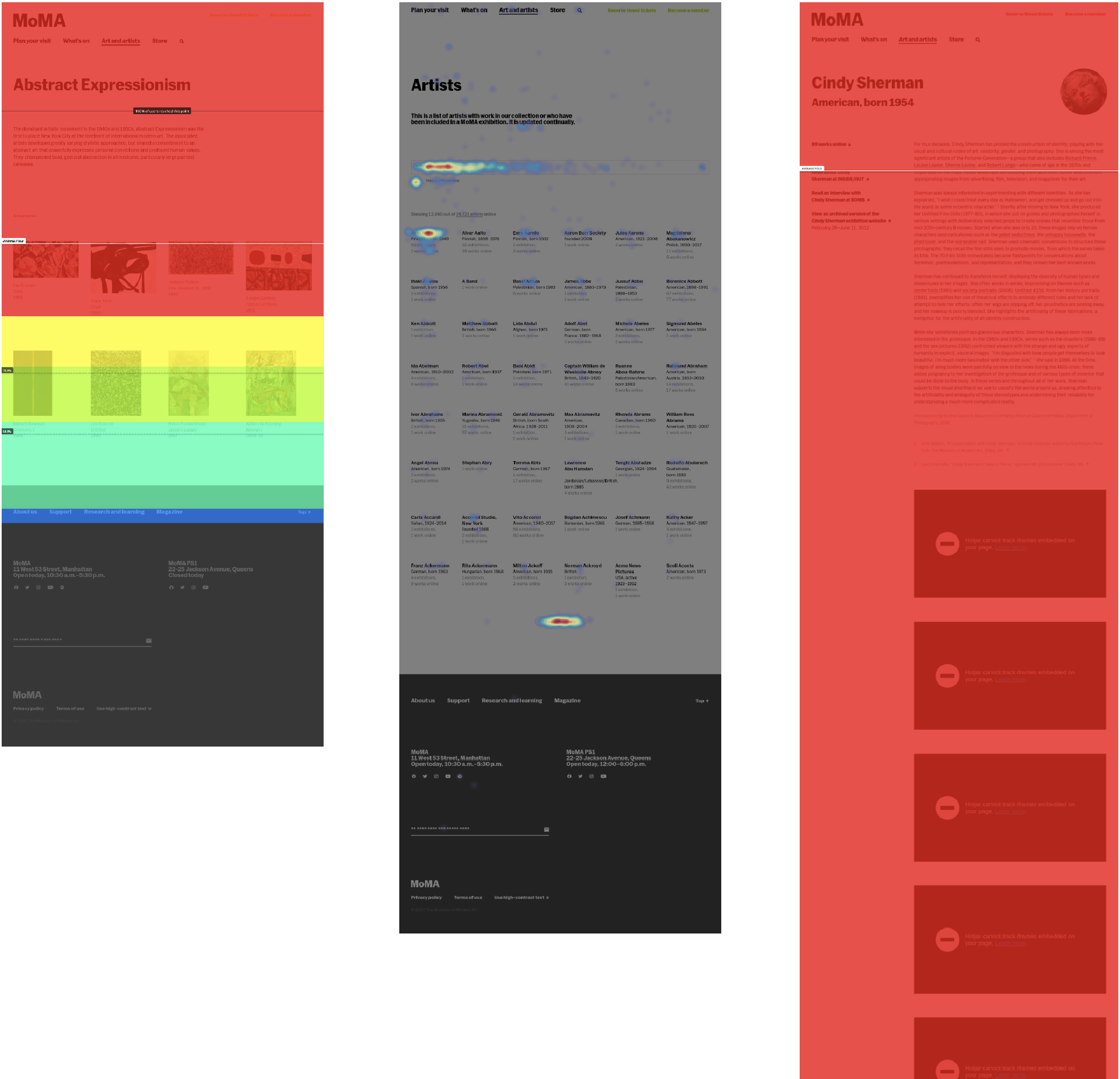
Heatmap of clicks on the artist index
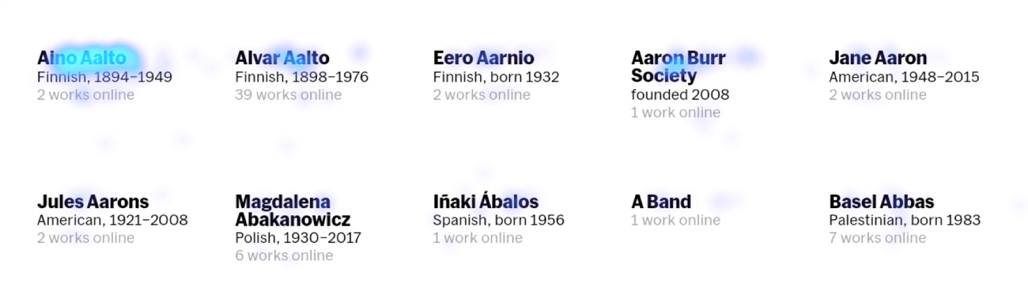
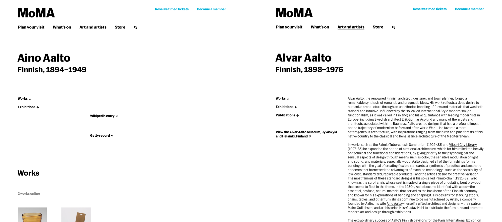
One interesting finding in our Hotjar analytics was that on the artist and art term index pages, users were frequently clicking on the first results. The problem is that because these pages were sorted alphabetically, our first results, such as Aino Aalto, did not always have content on them, leading to a less than ideal user experience.
Difference in the two Aalto pages
Product inception #
Heatmaps from Hotjar, one of our several analytics tools
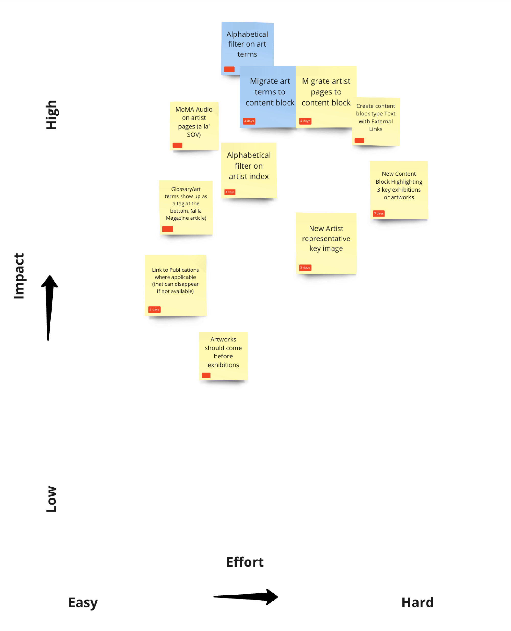
In our cross team inception, Jackie Cruz and I facilitated the definition of goals, antigoals, and risks as well as the creation of user stories. I presented the results of our Hotjar survey, as well as additional Google Analytics data on most popular pages and bounce rate. With the rest of the team and stakeholders, we used this information to create our sprint stories and place them on an effort/impact chart.
A Miro board with our inception outline
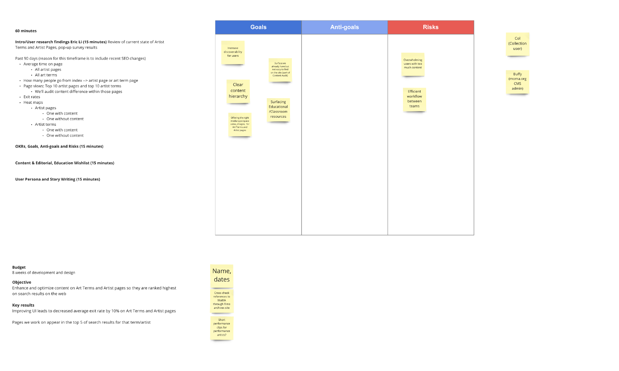
Feature pricing
Users and audience #
We had an existing set of user personas that our collection pages cater to. Cole, our collection user, is defined as a person who visits the website specifically to access the collection section of our website. Within this category, we had both casual users as well as educational and academic users—something that we often have to balance in terms of information density.
Other secondary users we were designing for included visitors that land on our site from search results, as well as visitors from other parts of the website. For these latter users, we wanted to ensure that there was clear landmarking for them to know where they were on the site, as well as ample opportunities to acess other parts of the site.
An additional user we cared about for this process was Buffy, our CMS user. Since a lot of these features would require significant content development, we also wanted to make our CMS tools for maintaining the website as easy to use as possible.
Feature development #
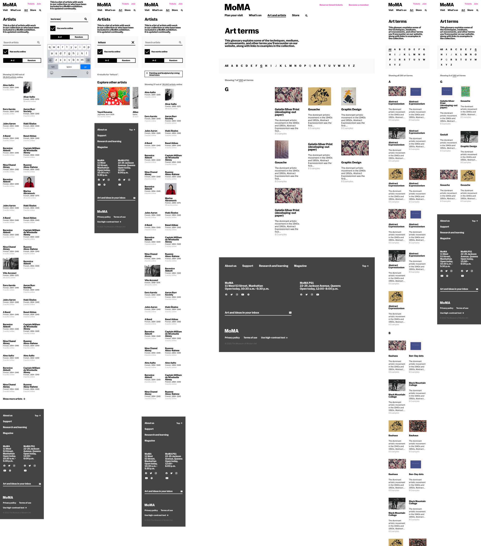
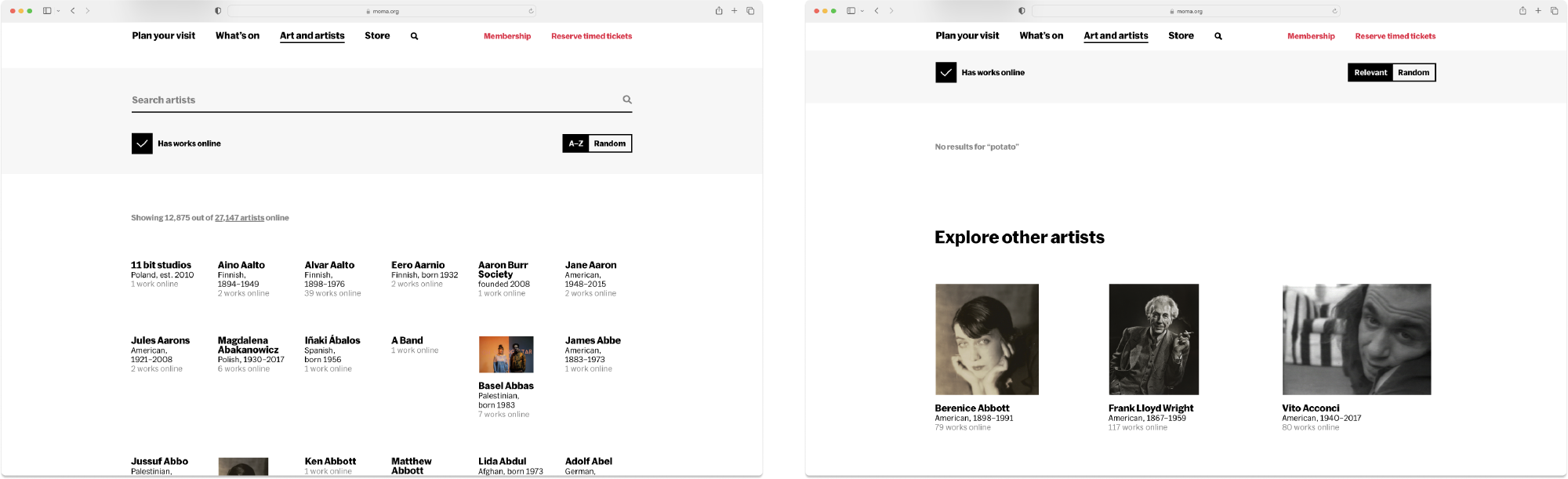
Artist index
To aid in discoverability and make our Artist index more visually appealing, we added images to our artist index page, a redesigned search field, and the ability to sort by random. We also added a component for exploring other artists if your search query turned up empty. Since not all the artists in our collection had gotten an editorial pass, we also included a constraint that we would only link pages with content.
By adding a random button and images to our artist index, we aimed to increase discoverability
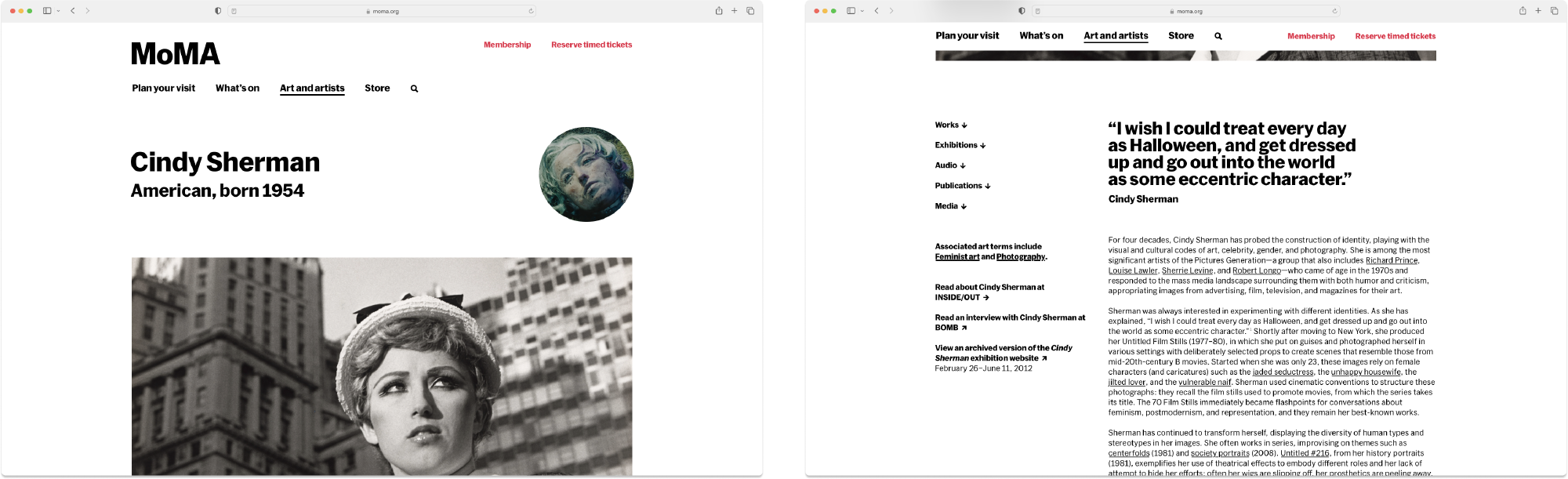
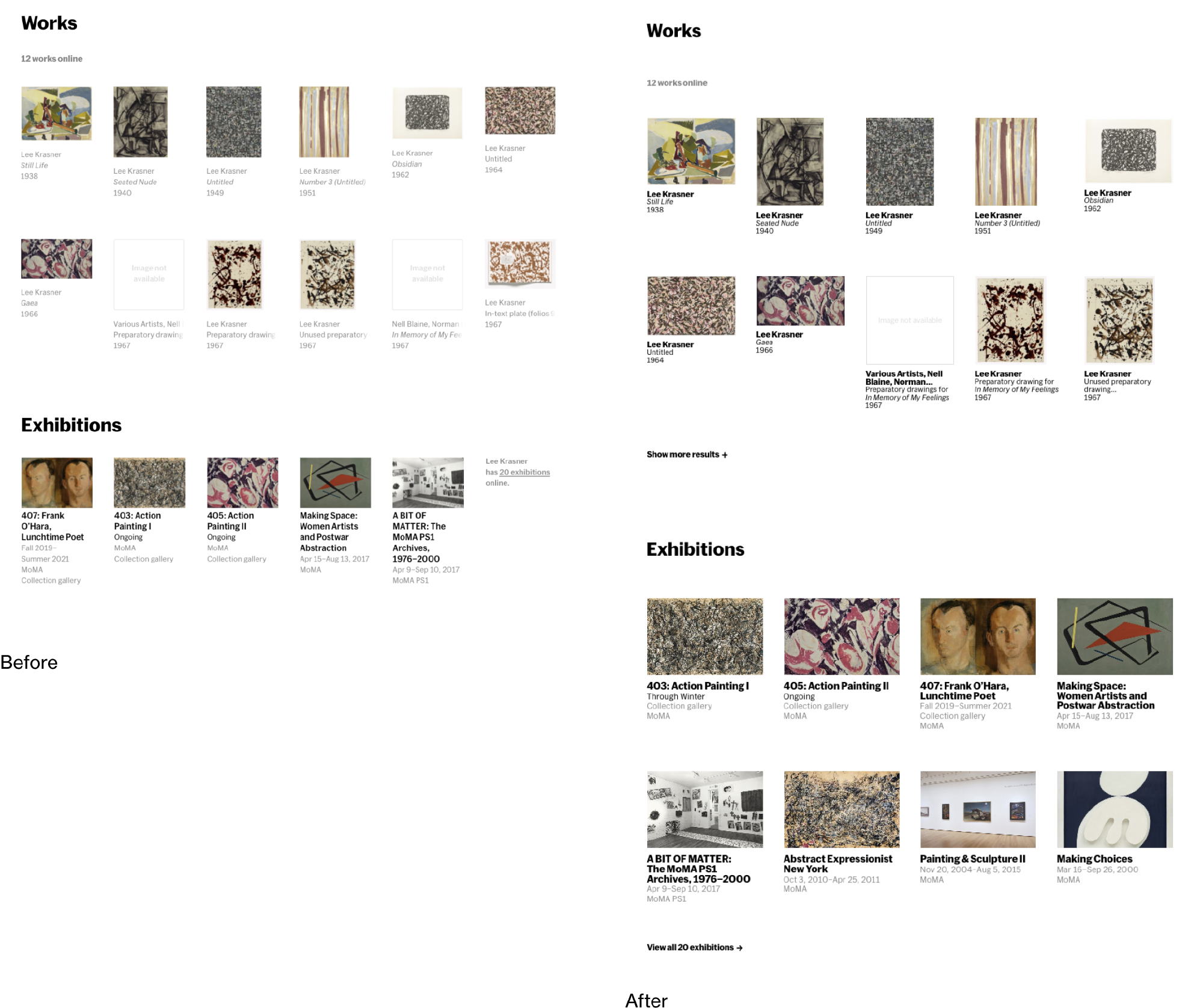
Artist page
On our artist pages, we performed a significant amount of content reorganization, aiming to make this page as content rich as possible. We introduced editorial style content blocks for richer storytelling, a dedicated media section, and the ability to see relevant audios to an artist. Above the fold, we also added hero and portrait images for those more visually inclined.
From an ergonomic perspective, we also introduced more structured section headings, as well as an auto generated table of contents. Our hope was to test the success of this design element on these pages for potential usage across the site.
We added more visual and dynamic page layouts based on user feedback to engage our audiences in a variety of media
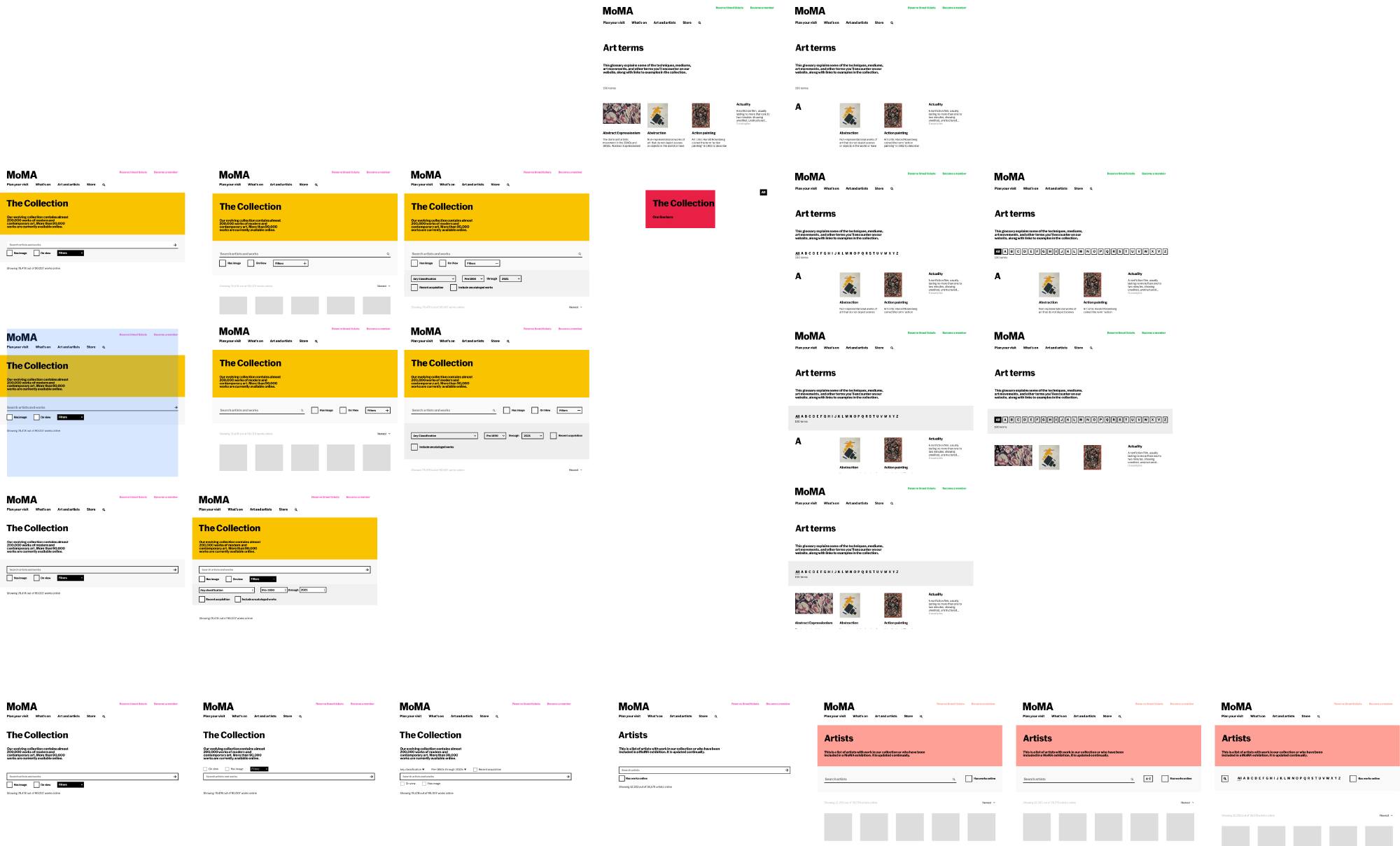
Art term index
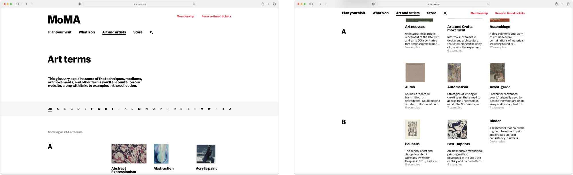
We did a very significant redesign of our art terms index, which previously only contained a typographic listing of the terms without any organization. As we were reaching over 200 art terms, this turned out to be quite unwieldy.
By introducing sticky section headings, we hoped to provide users with visual cues as to where they were on the page. We added an alphabetical filter at the top to also encourage users to jump to other terms instead of sticking with just the terms beginning with the letter A. We also included descriptive images that would make it easier for users to skim through the plethora of content.
Additional visual landmarks were added for easier navigation
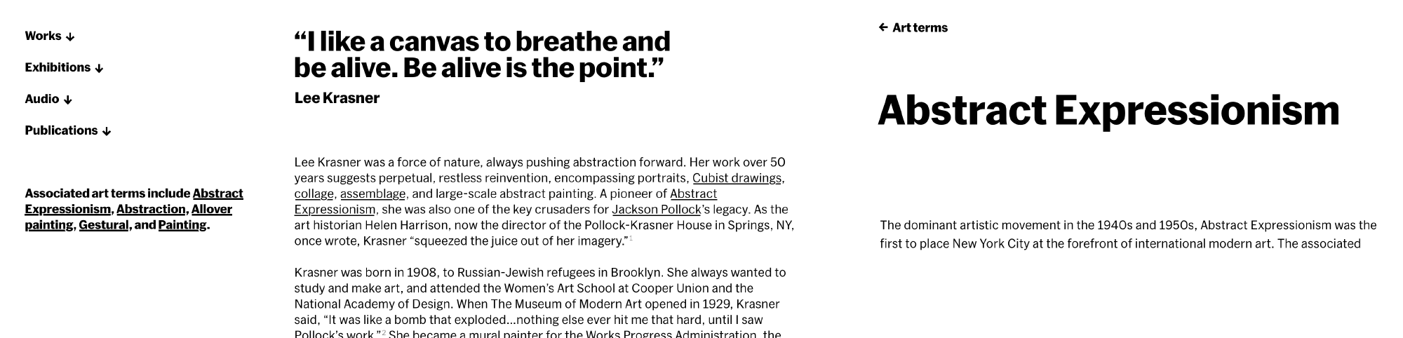
Art term page
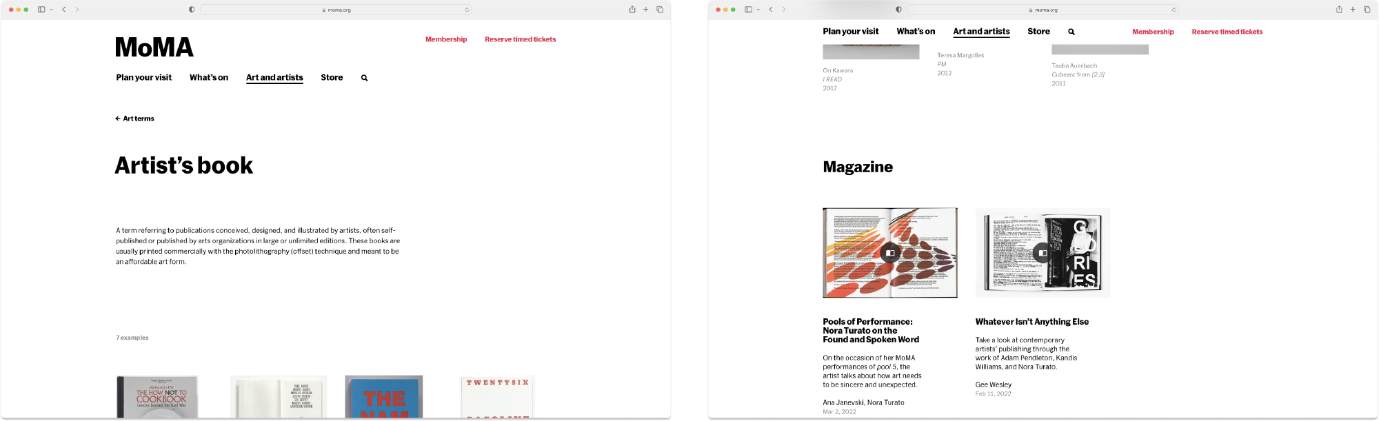
With the art term page, we introduced the ability to link to other types of content besides artwork. This allowed for the content team to give our users a broader array of examples of an art term. We also introduced a breadcrumb back to the art terms index—another feature that we wanted to test the efficacy of before potentially deploying to other parts of the site.
A broader range of content let our users explore other parts of the site
Design sprint #
Establishing a clear brand hierarchy for how our exhibitions are displayed on the website
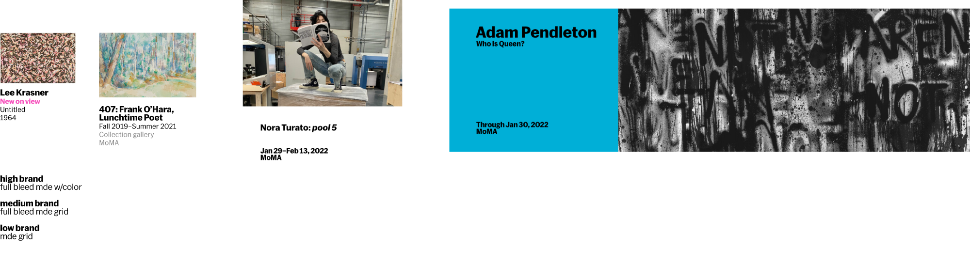
MoMA’s website has the unique position of being both a marketing and product platform. Oftentime we have to balance competing priorities in our design process. In this redesign, we decided that our collection pages fall squarely as reference pages and should receive a lower branding treatment, letting the content take center stage.
Establishing a clear brand hierarchy for how our exhibitions are displayed on the website
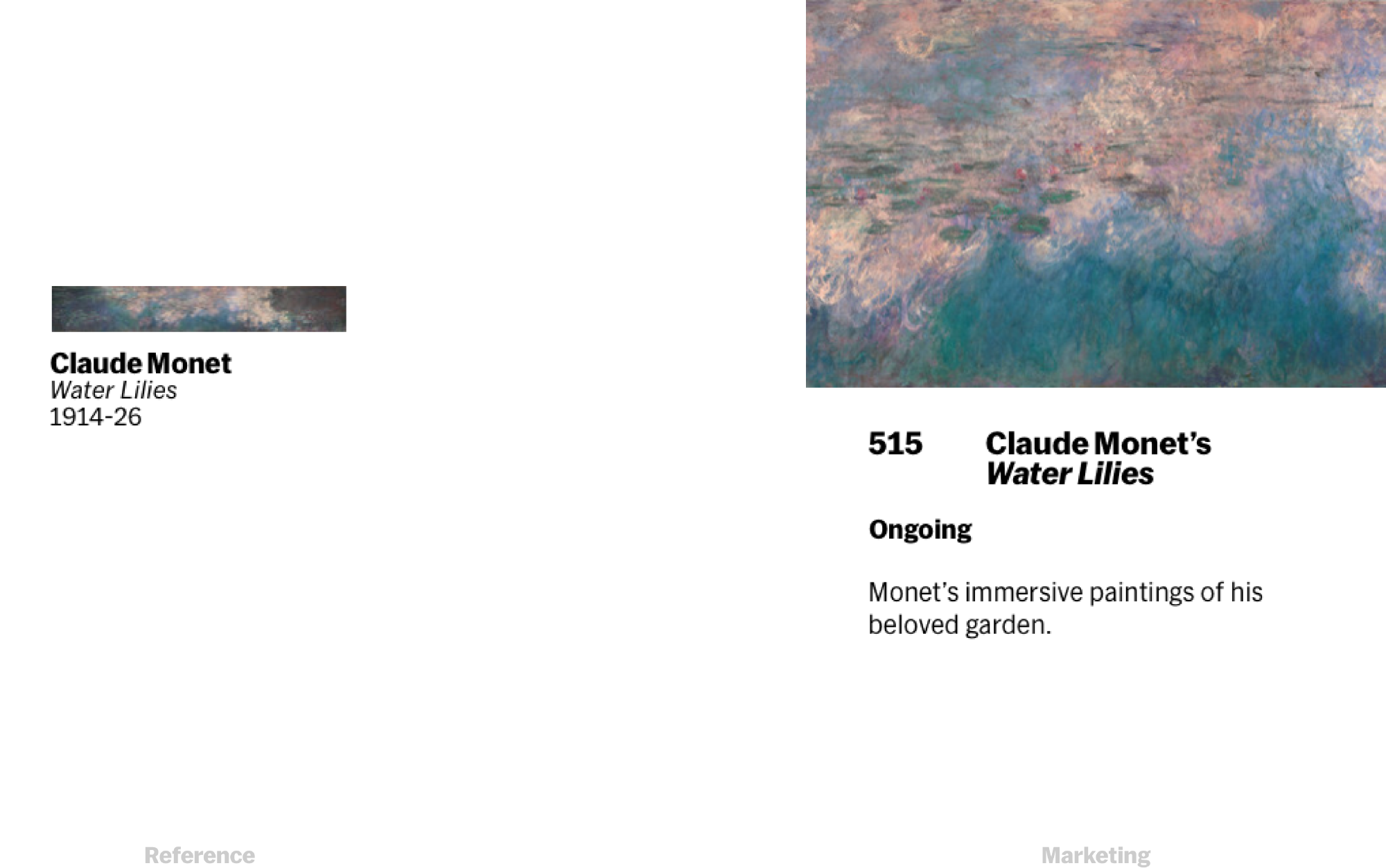
Since MoMA’s brand is so visually expressive, we also drew the line that on reference pages, full bleed images would not be used. This would elevate our more “marketing” pages at a higher level in brand expression. Our work also introduced back links and an autogenerated Table of Contents which could be reused elsewhere on our site.
Form component exploration for our index pages
Stephanie Schapowal and I approached this design process pragmatically, deploying from our existing design system what we could, and adding new design components only when necessary. This helped to limit scope creep and keep us on schedule. As part of this project, we updated the design of these pages from our older, Made Thought era, design to the one established in 2019.
Design refresh removes our medium weight and makes things a bit more bold
Design detail of the refreshed pages
Results #
In redesigning our artist and art term pages, we were able to feature significantly more diverse content and visuals on these otherwise lackluster reference pages. By introducing new design elements such as a table of contents and breadcrumb, we also used this as a test bed for new features we might potentially add to the rest of the site. On our index pages, we also introduced additional features for discoverability such as a random button on the Artist index. After this work was completed, we noticed a decrease in bounce on these pages, as well as new Hotjar reporting which showed heavy usage of our discoverability features.
Final designs of our index pages