MoMA’s 2019 rebrand necessitated an equal refresh of the Museum’s website. We worked with Doberman to bring this brand expression to life on moma.org. I worked closely across design and front end to implement these designs in our codebase, making adjustments to the designs in code to handle edge cases that hadn’t previously come up. Driving this implementation was a focus towards solid typography and componentization — I created several key components that are the foundation on which the website currently is built.
Background #
2019 was a significant year for MoMA. Not only was the museum going through its third largest expansion in its history, but we were in the process of redesigning the Museum’s identity. Based on the 15th floor of the Museum’s offices, the Creative Team was assembled as an in house studio containing Digital Products, Graphic Design, Marketing, and Content & Editorial. Together, we represented almost all of the Museum’s external facing surfaces. Digital Products was responsible for all the Museum’s digital surfaces, namely the website moma.org, which received upwards of 15 million visitors a year.
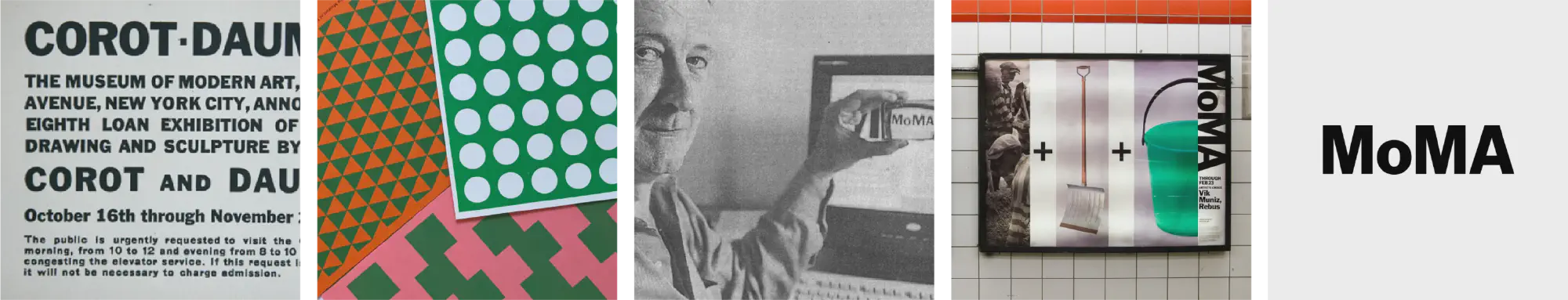
MoMA’s identity has played a significant part in the landscape of design’s visual vernacular.
In 2019, the Museum worked very closely with Order to create a new brand identity. We had outgrown our previous Made Thought identity, and were in need of a brand refresh to carry the Museum forward.
Graphic Design, then led by Rob Giampietro worked with Order to establish the Museum’s new identity and produce an entire suite of marketing and printed matter to match the arrival of a new MoMA. This included commisioning Christian Schwartz of Commercial Type to create a custom cut of our in house typeface called MoMA Sans. Previously, we had used MoMA Gothic which was designed by Matthew Carter.
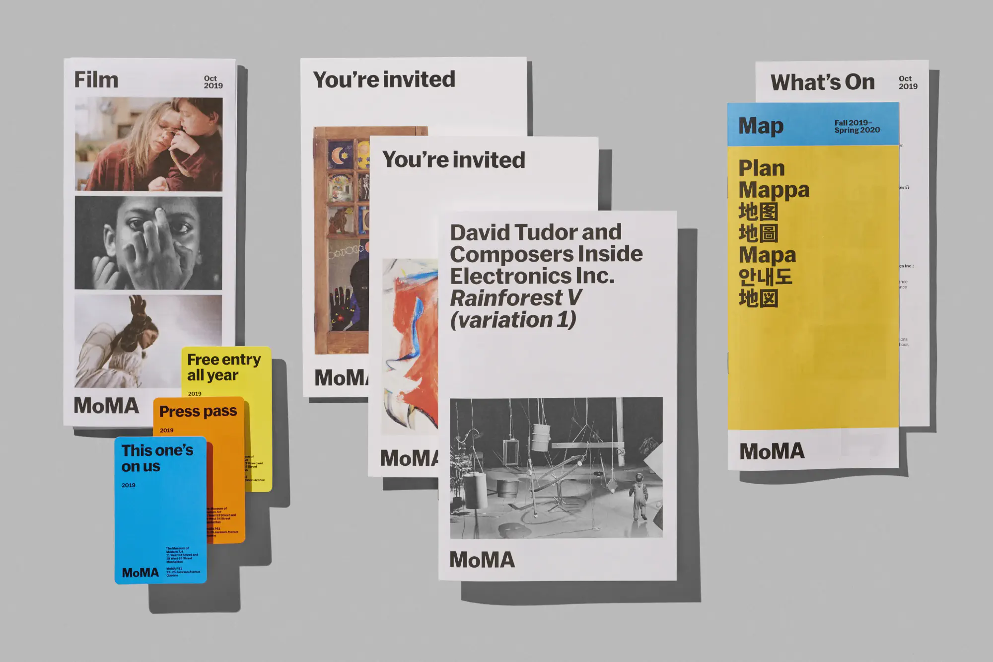
A small sampling of all the printed collateral produced as part of the Museum’s 2019 rebrand.
You can learn more about this process in Rob’s notes from an AIGA talk here.
Design #
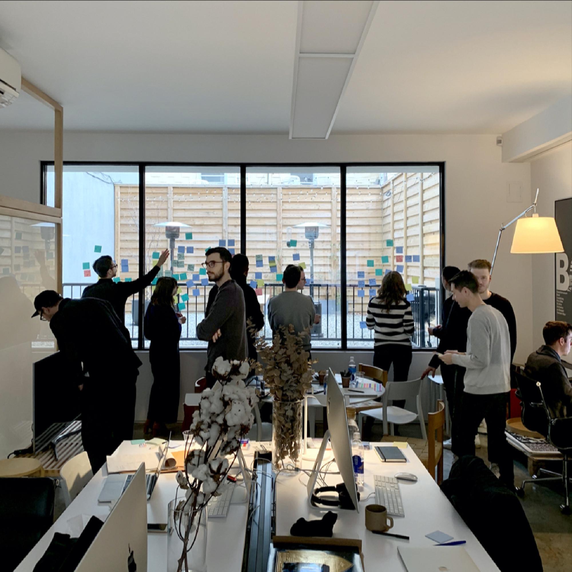
Design sprint and goal setting at Order’s offices prior to me joining the team.
With the brand standards of the new MoMA largely set in place, attention turned towards the website. Graphic Design and Digital Products worked with Doberman to provide a design refresh of the website, eschewing Made Thought era white for bold splashes of color and typography.
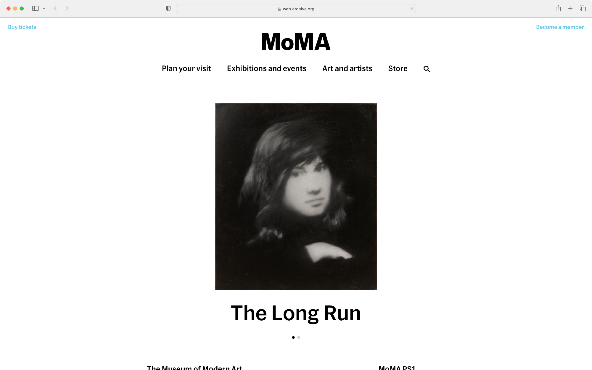
MoMA’s website, circa May, 2019. Accessed from archive.org.
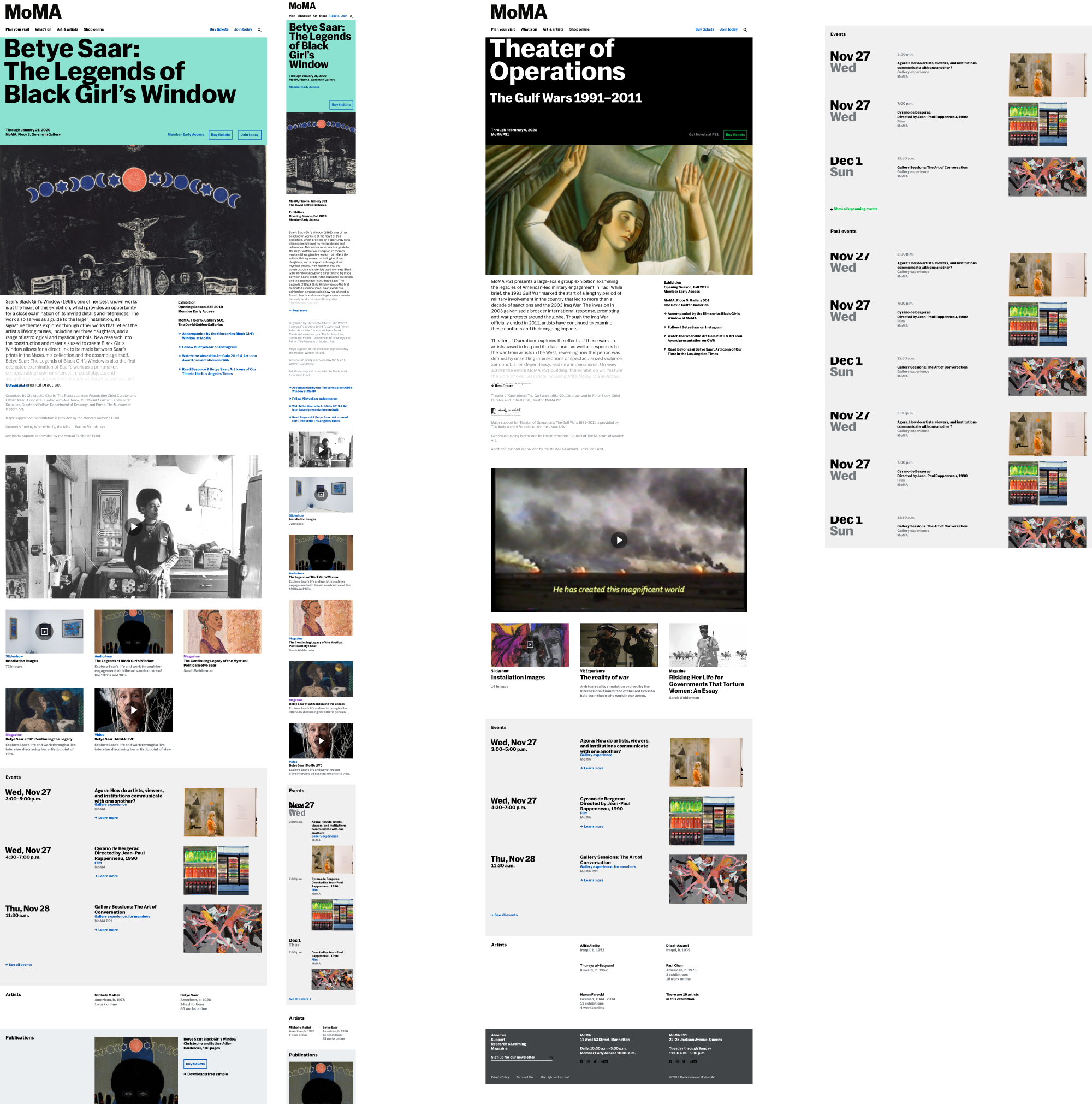
Based on page view data from our analytics, Doberman was tasked with redesigning key pages of the website. This included the homepage, exhibition index, multiday event pages (what we called exhibitions), ticketing, events, and our Locations, Hours, and Ticketing page.
Core to this process was not adding any content not already on the page. Given that this project was on a tight schedule, we wanted to reduce any additional engineering overhead.
Through this back and forth design process, we evolved the designs to handle edge cases that only MoMA had. Some of our exhibitions and collection objects have absurdly long or otherwise uncommon naming. Internally, we had what Michael called “the Rauschenberg test”, meaning that no matter what screen size, the word Rauschenberg could had to fit in its container. These rules of thumb helped shape the Doberman work into a viable set of designs we could build from.
Doberman’s exhibiton page comps.
Development and Sol #
Shared components and Atomic CSS allowed design to be less involved in implementation.
Design had always been a blocker to engineering at MoMA. We saw the redesign as a moment to try to address these issues by investing heavily in a component based system (our stack is built on Go, Vue, Ruby on Rails, and Jekyll) and creating a bespoke Atomic CSS library which we called Sol, after the conceptual artist Sol LeWitt.
Many design elements that were introduced by Doberman and Order were stress tested and refined as part of this stage. A guiding principle of the website was to never touch the art. This meant leaving canonical views of works uncropped. However, a key component of the redesign introduced cropped and fullbleed images in high brand, marketing moments.
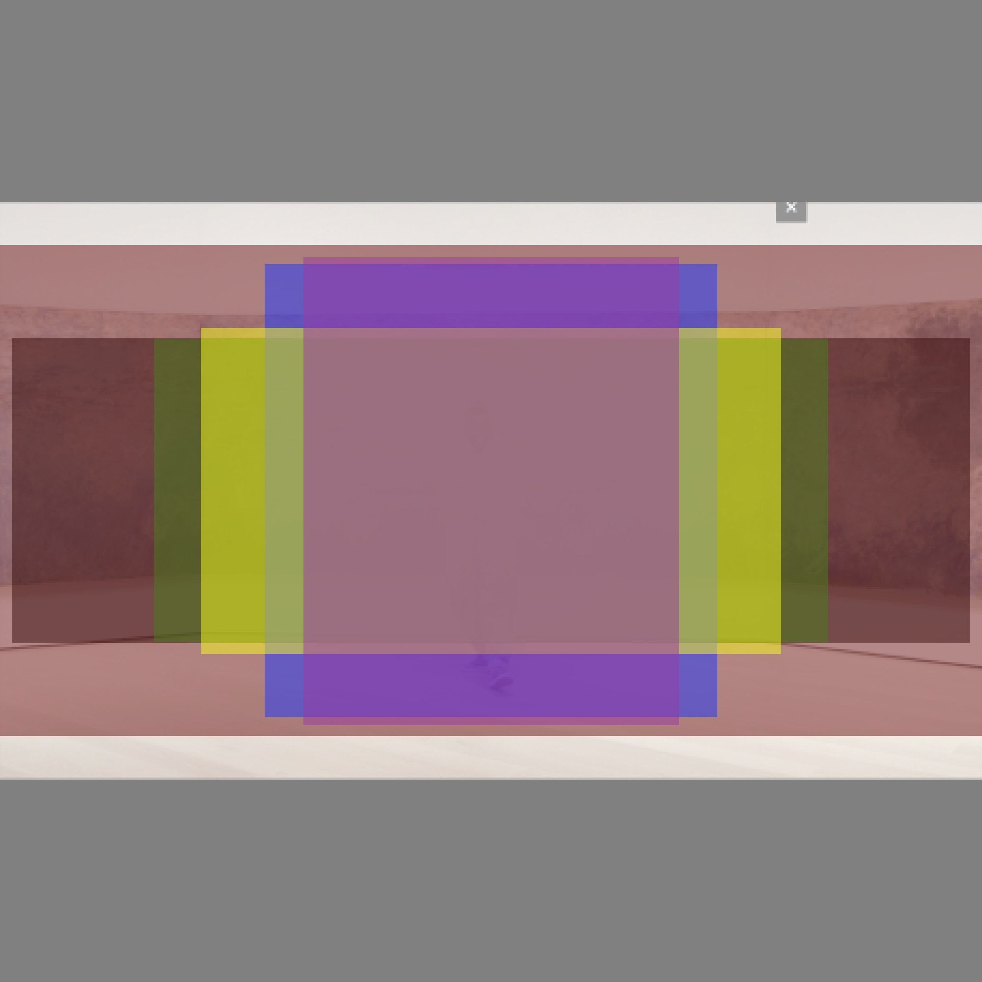
Photo safe zones that Stephanie Schapowal illustrated to show how works would be cropped on the homepage.
Michael and I spent a lot of time coming up with the right amount of cropping and image gravity (top, middle, bottom) heuristics to allow for the best possible presentation of work and material. With full bleed now apart of the website’s visual vocabulary, we also had to height constrain images to fit within the viewport, while still showing content above and below the fold.
Baseline alignment across mixed elements and type sizes.
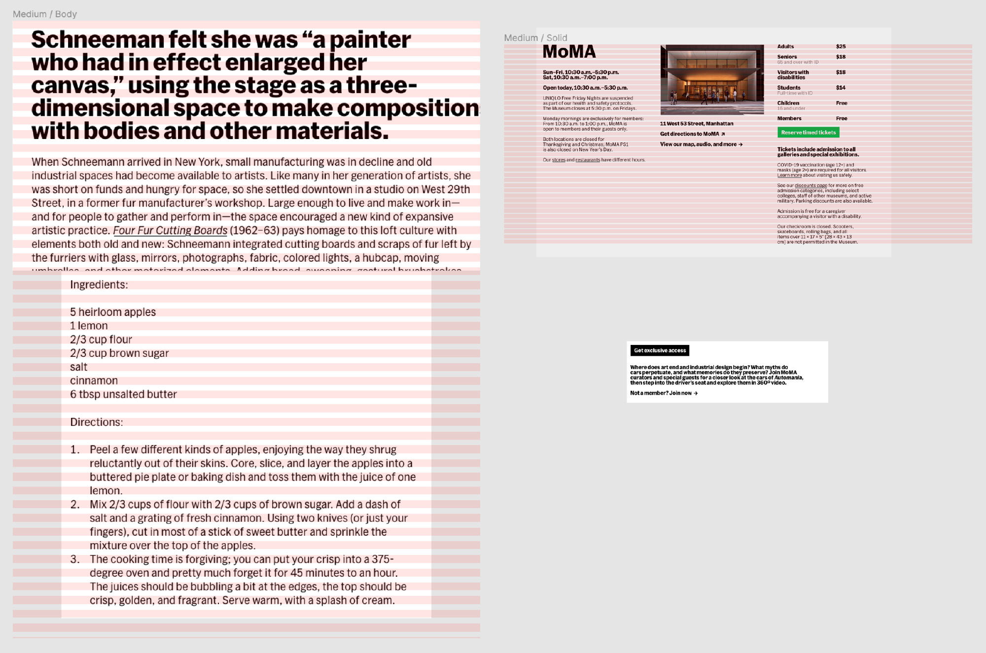
Michael and I also developed a bespoke Atomic CSS library akin to Tailwinds which included custom CSS classes and JS behavior core to MoMA’s brand expression. Things like consistent spacing and responsive type sizes could be applied with a simple class. We even spent the time to develop bespoke typesetting throughout the website to ensure consistent baseline alignment across columns and type sizes, as well as classes which allowed us to use typographically derived spacing (cap and line heights). Since MoMA’s brand was so closely tied to good typography, we felt these efforts were well worth the time.
moma.org had a lot of breakpoints — 14 to be exact.
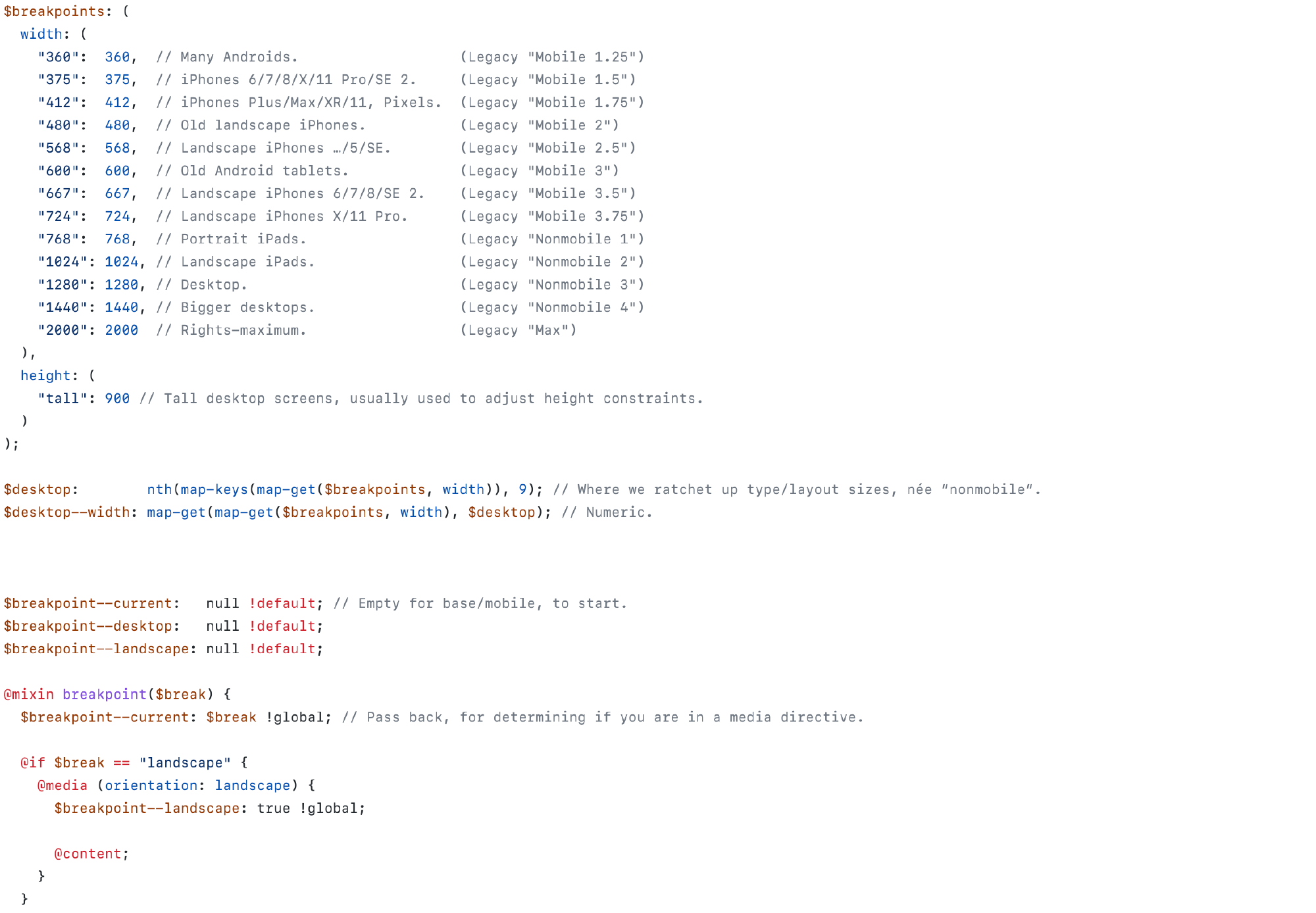
In addition to good typography, we also cared about putting our best foot forward at all screen sizes. This leaves little room for error in a digital environment, where there is often little control over the screen that the website is viewed on. As a result, we had to care about how the website looked at every possible dimension. Using information from analytics, we set up 14 breakpoints that we meticulously checked when implementing designs, to make sure that we always put our best foot forward.
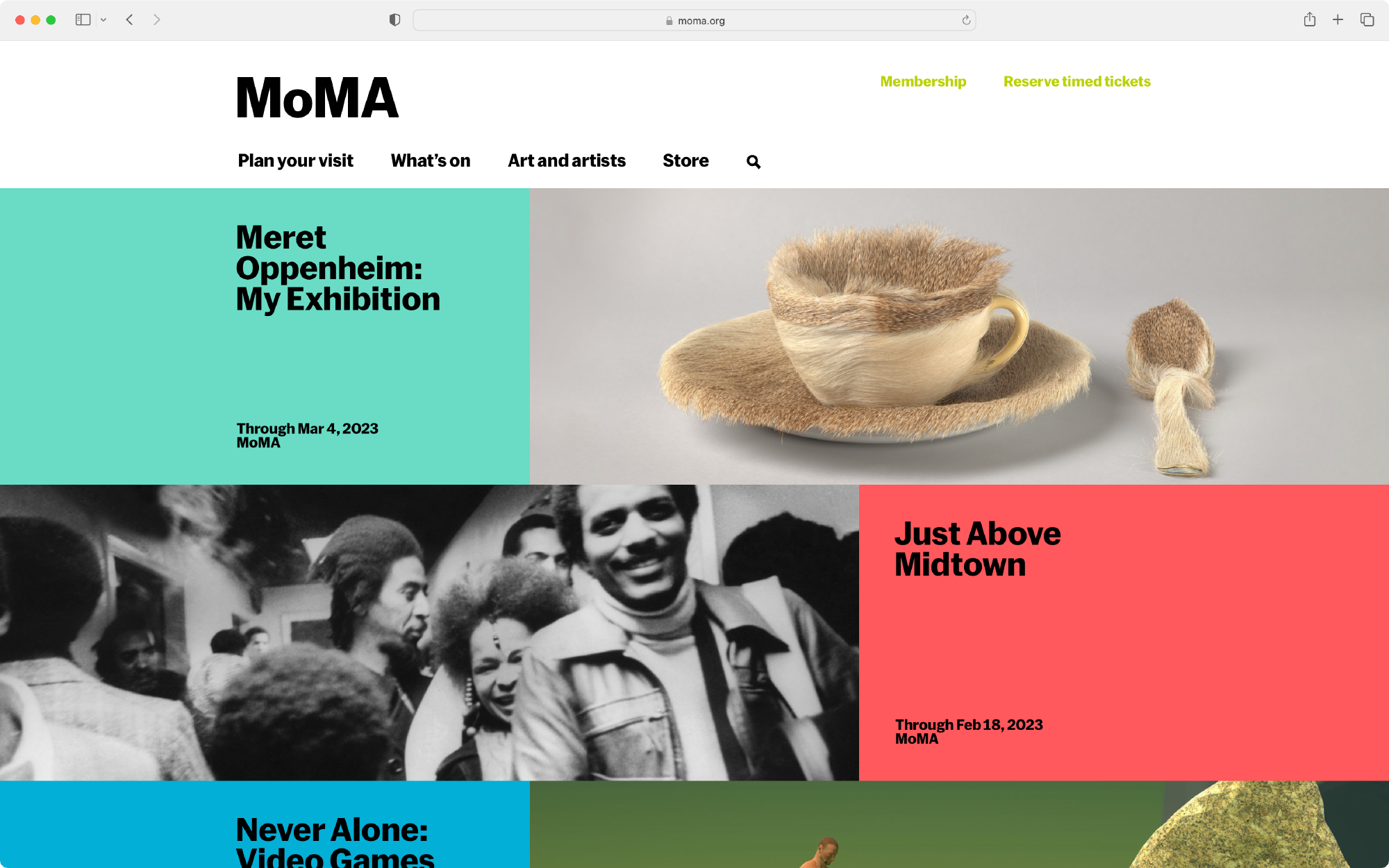
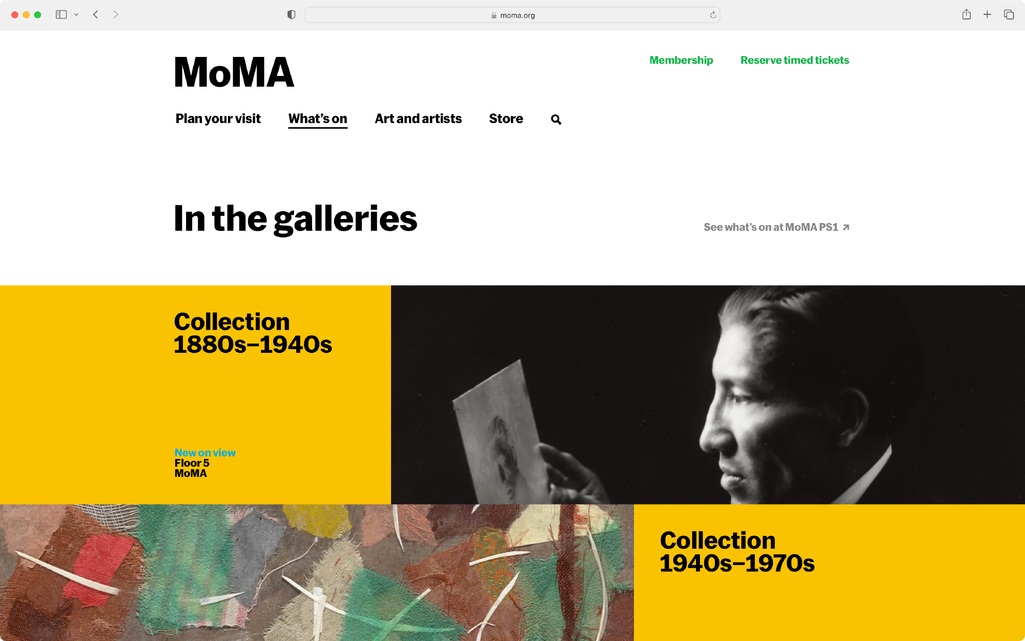
Screens #
Homepage
What’s on page
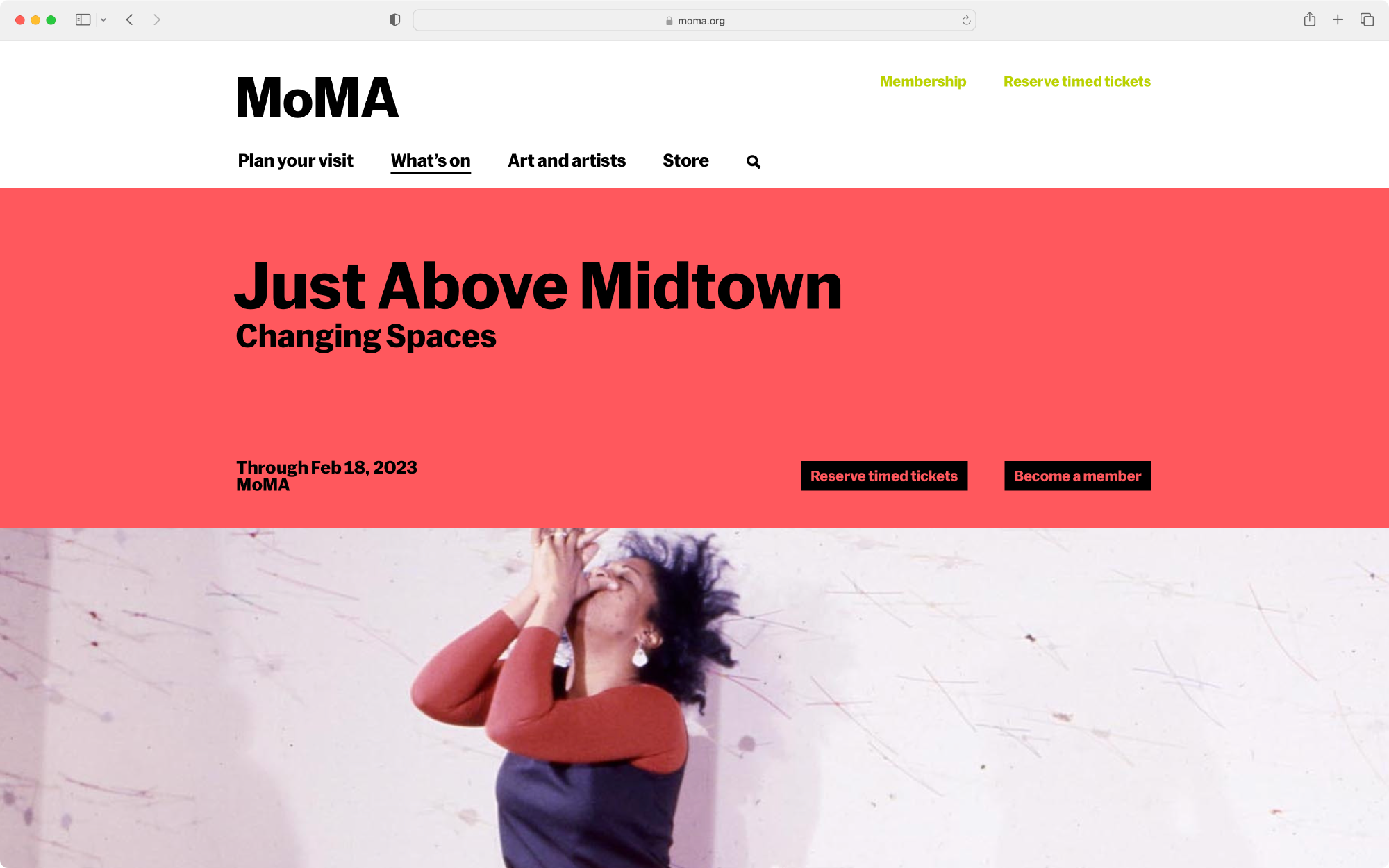
Exhibition page
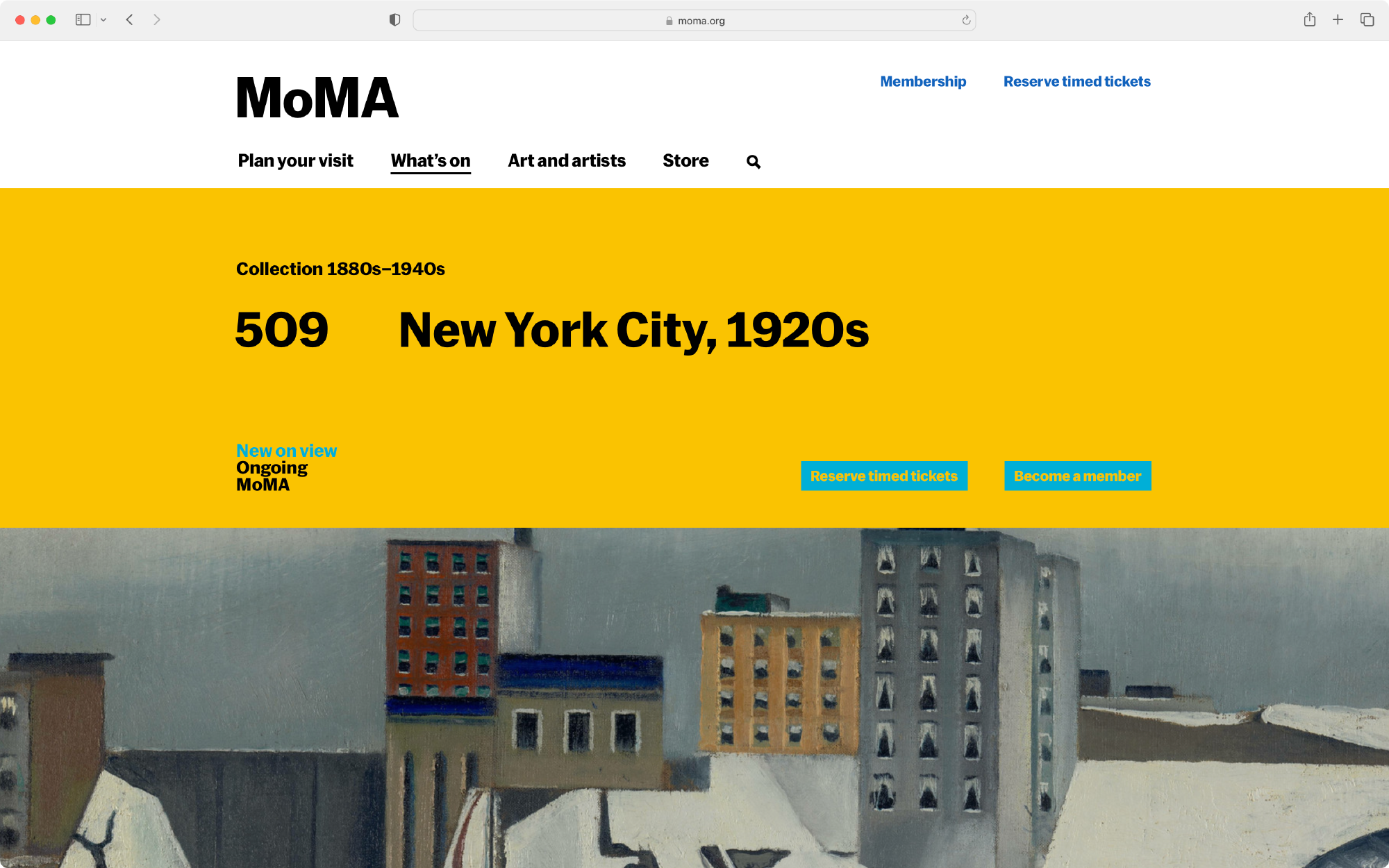
Collection gallery page
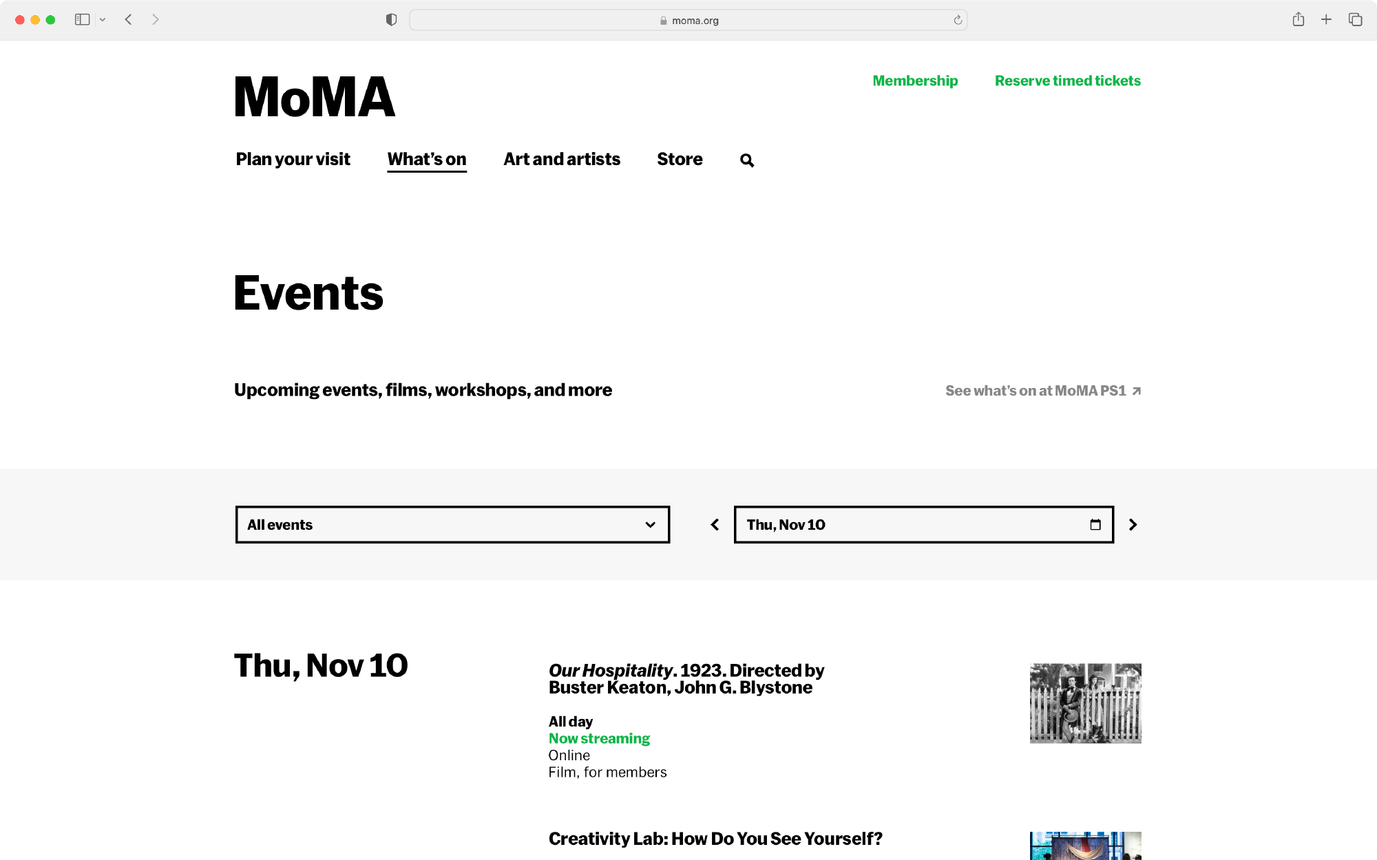
Calendar
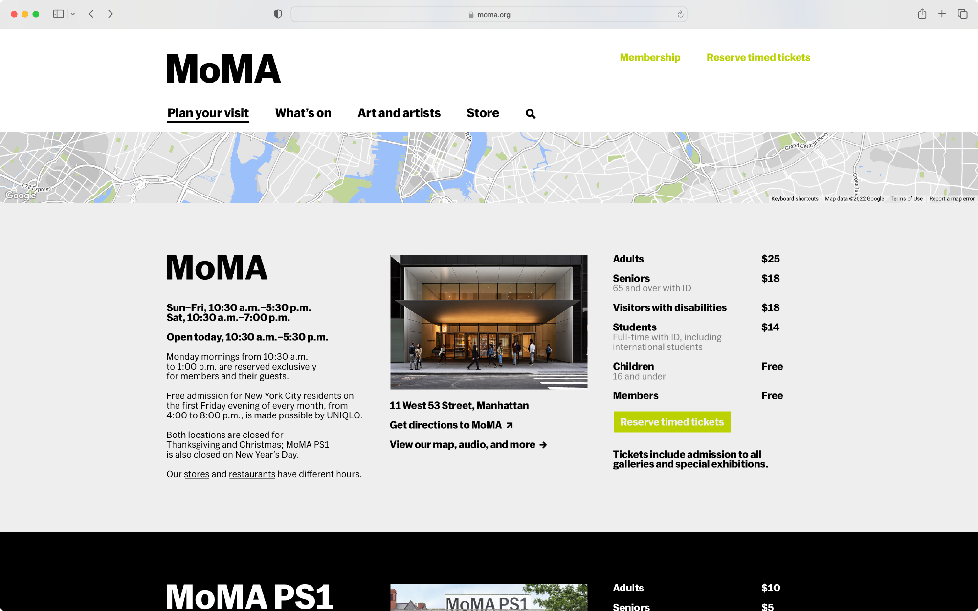
Locations, Hours, and Admission page
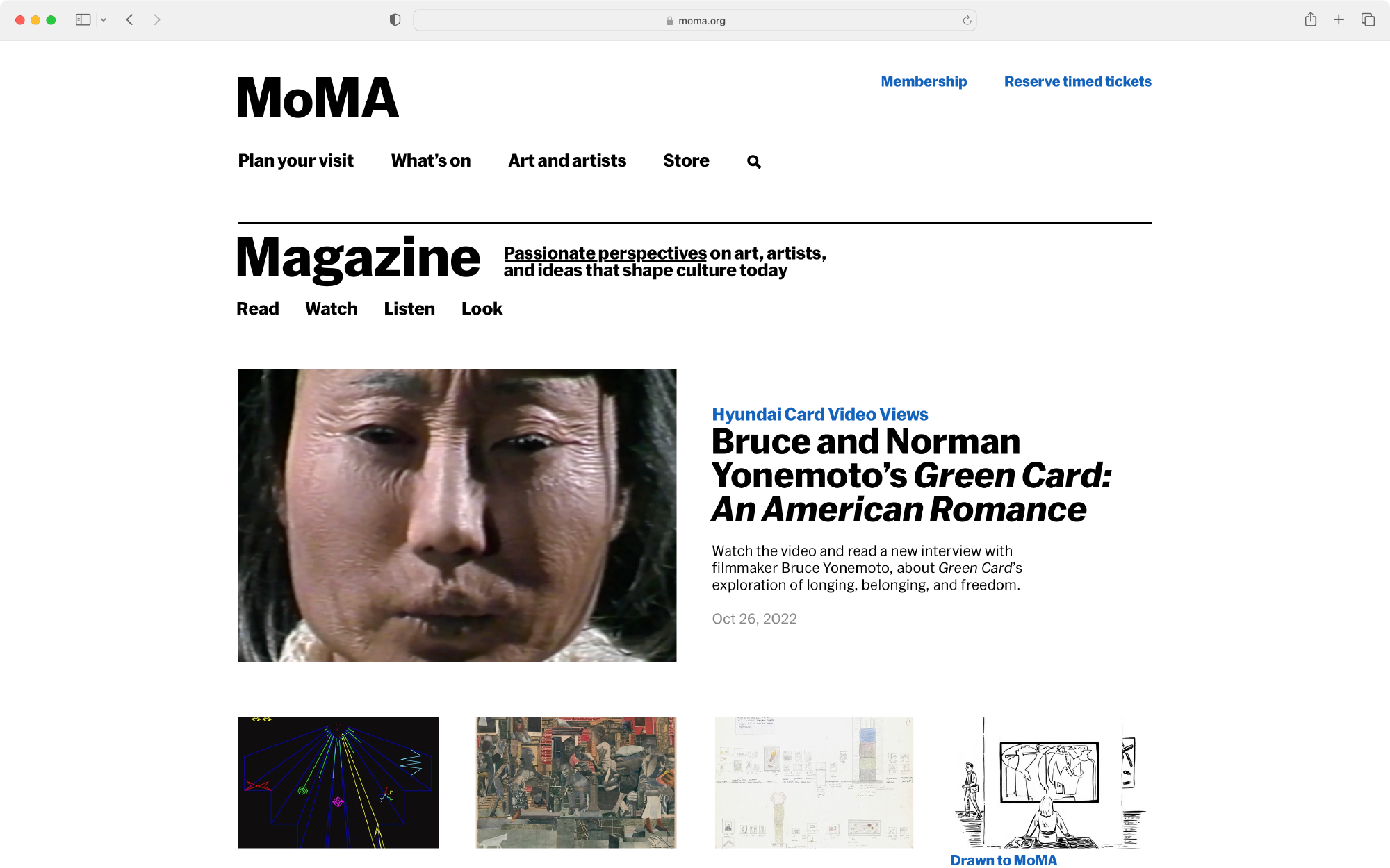
MoMA Magazine
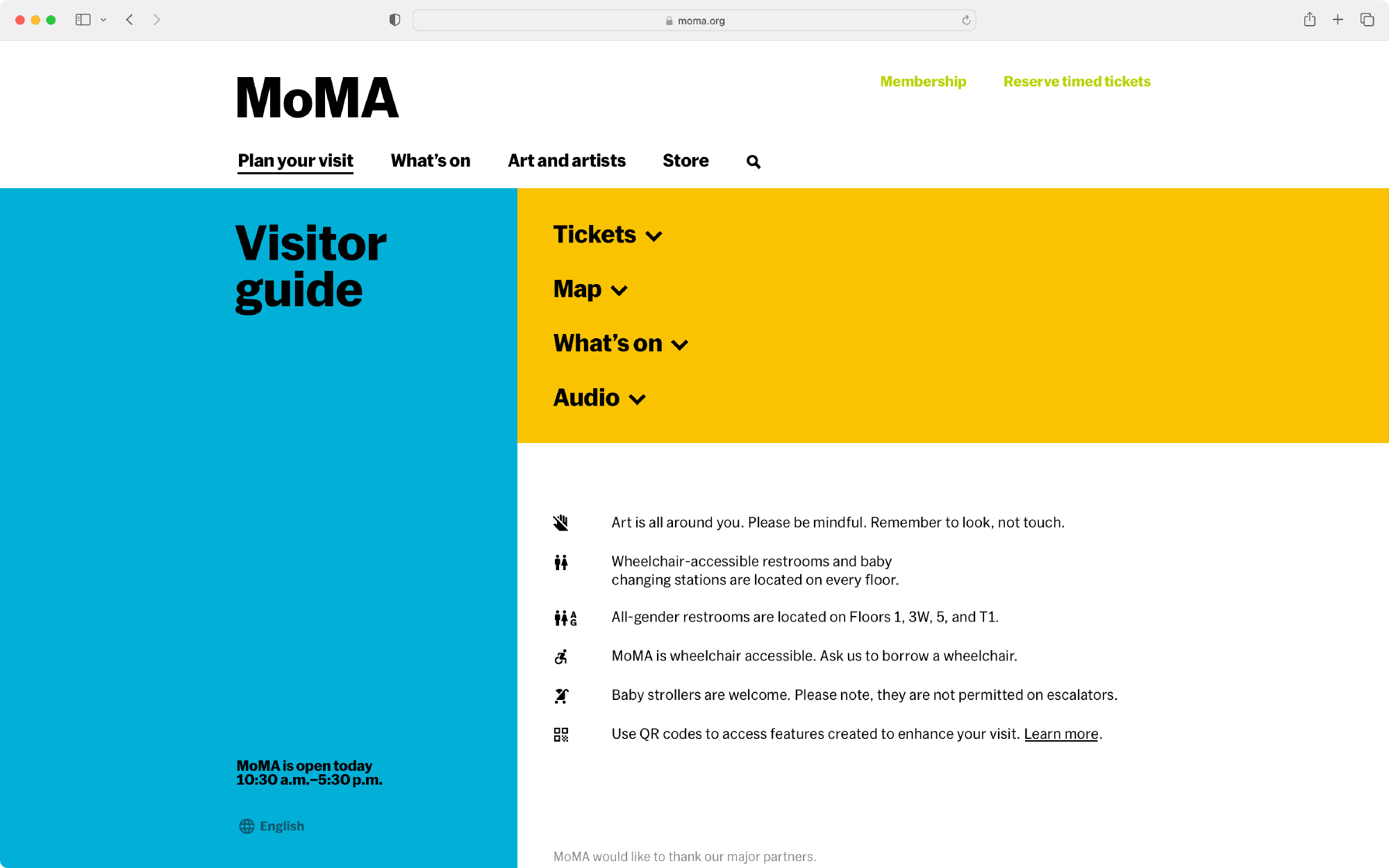
Digital Visitor Guide