MoMA has three different digital properties (store, moma.org, and membership) with segmented user accounts. As part of our roadmap, our goal was to create a unified single sign on so that a user could remain logged in across all of our websites.
I led the product design of this experience, starting with initial user research and behavior. From here, we had a product inception where we defined our users and core journeys. We then dived into untagling all the edge cases that arose and enumerating the different screens that we would have to design. In the design process, we also had to balance between expressing MoMA’s brand successfuly and providing enough information architecture to support some of the more complex user behaviors we needed to.
Through user testing, we focused on preventing drop off and confusion, refining the order and IA of some of our flows based on our findings. Finally, I built the front-end experience of our login pages using Sol, our in-house atomic CSS library, and Vue.
Process #
Much of the work around SSO was backgrounded by the longer product vision of having members-only content on moma.org. We viewed SSO as the first phase of this process and began with a product inception.
To prepare for this, I researched analytics and behavioral data based on a previous MVP version of members only content, focusing on conversion and drop off moments. One key point we found was that while we could do all the product and technical work to make this product a success, the content itself also had to be compelling.
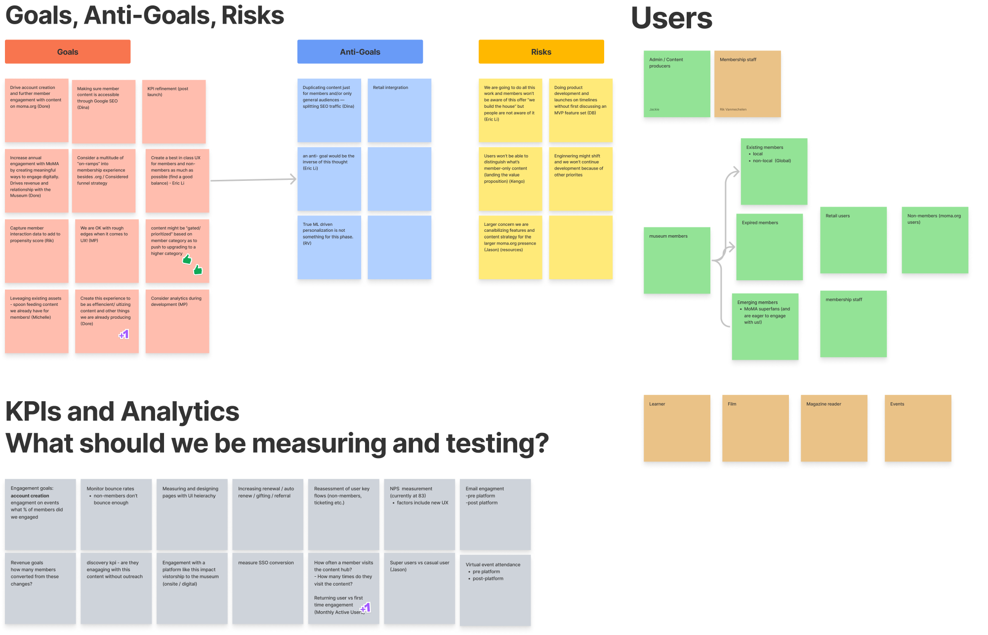
As part of our product inception, our team outlined goals and antigoals before I dove into a mini-workshop where we discussed core user journeys around both member-only content, as well as SSO.
FigJam inception document
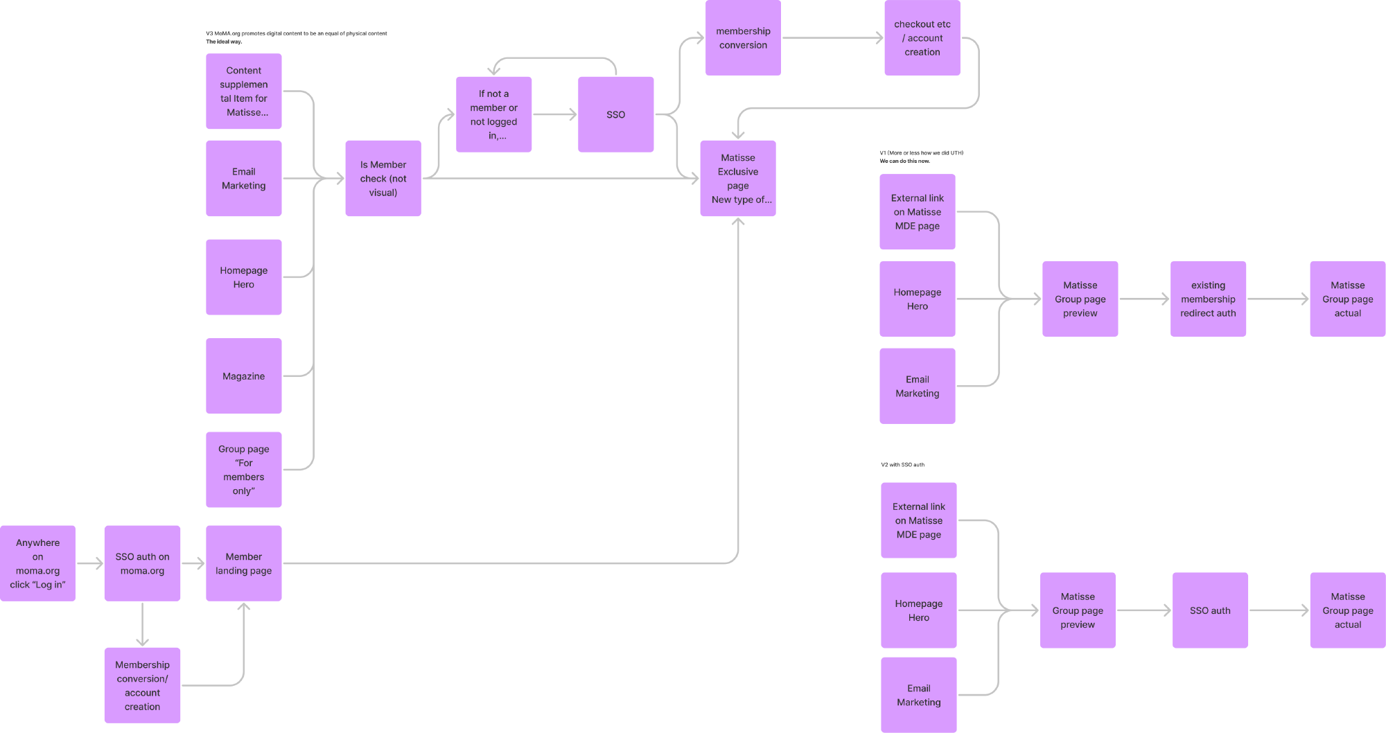
Stephanie Schapowal and I laid out three user flows for accessing member specific content via existing authentication, via SSO, and a north star journey including yet to be completed product work. This helped us make sure that we were designing with an end goal in mind and let us gut check our user journeys throughout the process.
Brief subset of high level user journeys for member specific content
User Journeys #
After our inception, we spent time determining who our SSO product users were:
- Existing members: local and non-local members of the Museum who logged into our membership services using last name and member number.
- Expired members and emerging members: those who were at one point or close to becoming members.
- Non-members: existing users of moma.org that didn’t have a membership.
- Retail users: users who had existing accounts on our retail site (email and password login) who are either existing members or non-members.
As we dived deeper into our SSO user journeys, several problems began to arise. While we wanted to ensure that the core user journey stuck to existing mental models of authentication (as simple of a email and password login as possible), we realized that there were several core edge cases we also had to untangle:
- Memberships that could have multiple accounts associated with them, such as family memberships.
- Existing retail accounts that no longer had a membership.
- Bad data where a user might have multiple lapsed memberships but one active membership.
We also needed to create user journeys for account creation when signing up for a new membership, gifting, and password recovery. When this project was initially proposed, our stakeholders believed that introducing SSO would just be the interstitial login screen. But through this process, we aligned on the fact that we would need to spend the necessary time to get this experience right.
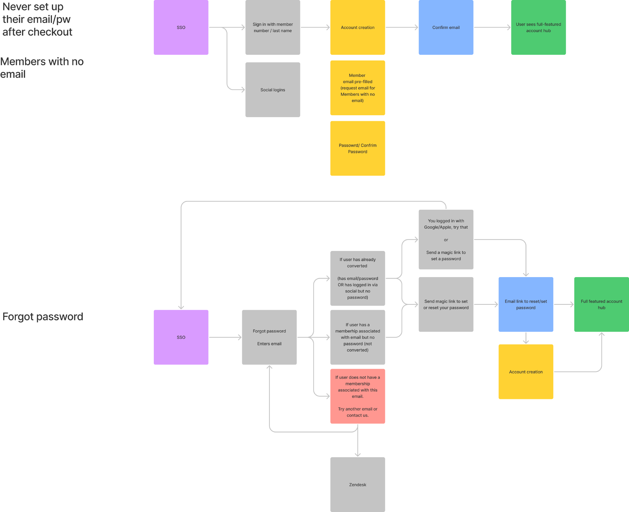
Deep dive of various user journeys needed to be handled with SSO
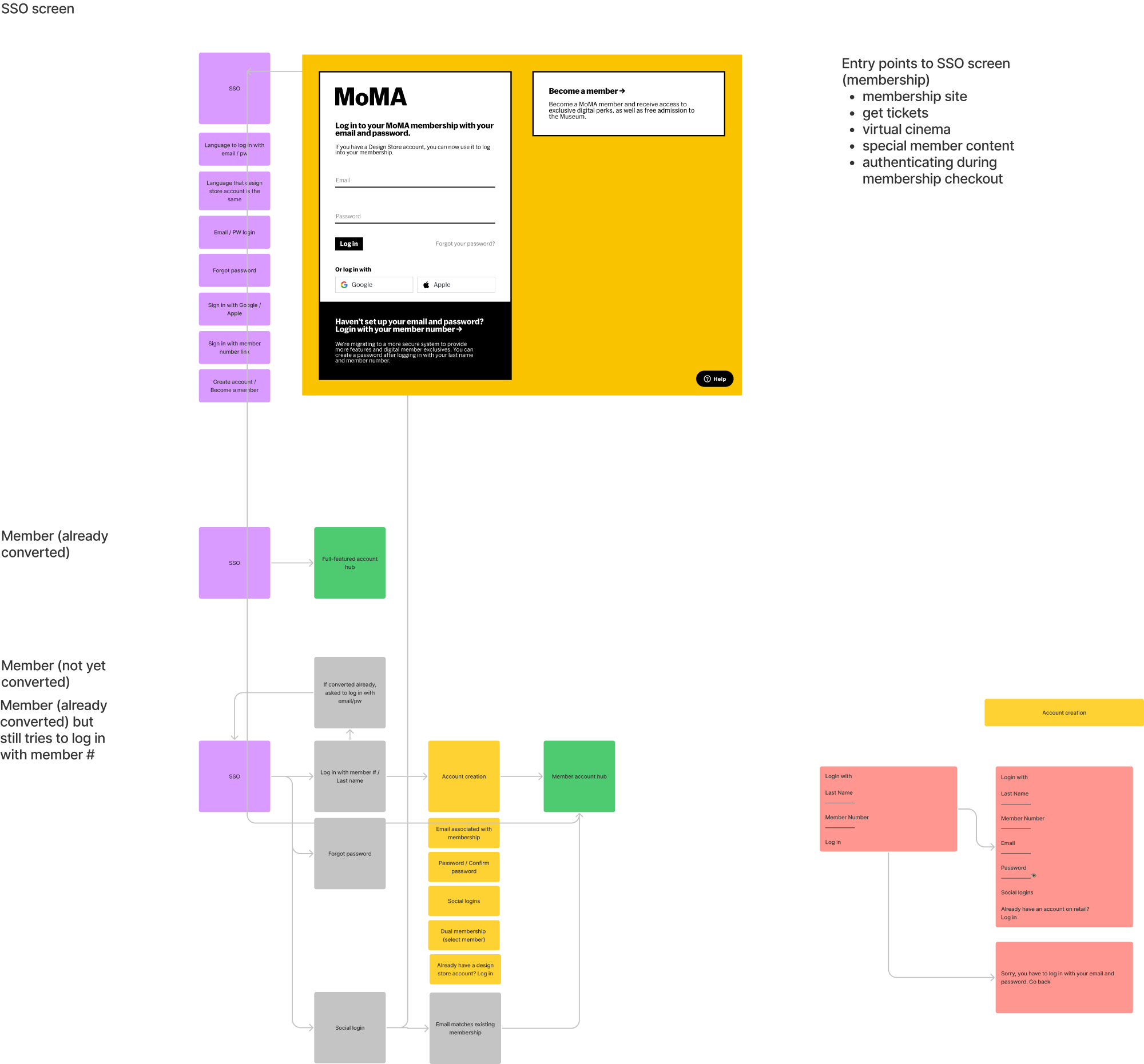
Some additional journeys needed to be handled with SSO
Design #
By outlining our user journeys and screens prior to design, we were able to prioritize which core experiences we would support at launch.
Given that we wouldn’t have time to handle all of the edge cases, we also designed for moments that drove users to a Zendesk widget and discussed with Membership how to handle these cases. This process also let us understand which screens and components we could reuse throughout the user journeys so that engineering wasn’t doing duplicate work.
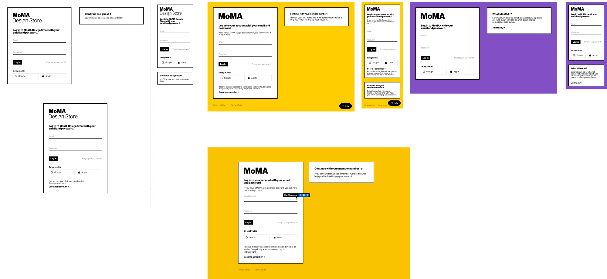
Once this was completed, we moved into design, creating account creation screens, conversion flows, forgot password flows, and error states.
Design comps for our user testing prototype

Both retail and Membership wanted different content and branding on their login experiences and we found that having a modular approach allowed for this flexibility. We kept our core login dialog on the left, and let the right side of the screen be flexible to handle checking out as a guest (retail), and account conversion (membership). This let us balance stakeholder desires with a simple and recognizible log-in interface across all surfaces.
Of particular challenge during this process was the need to create additional design elements that didn’t already exist in our design system such as the Google and Apple authentication buttons, and radio buttons for family membership account creation.
User testing #
Once we had gone through several design revisions, we turned to user testing. In this process, we focused on ensuring that the core log-in experience wasn’t confusing to users. We also wanted data on whether our approach to account creation and conversion made sense—making sure that users didn’t get stuck in endless loops.
We worked with the Membership team to canvas an audience of existing and non-members to test our experience on.
Notes from our user research focusing on the check out screen
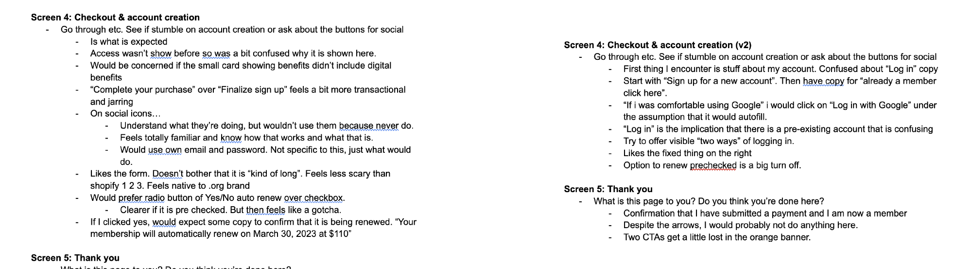
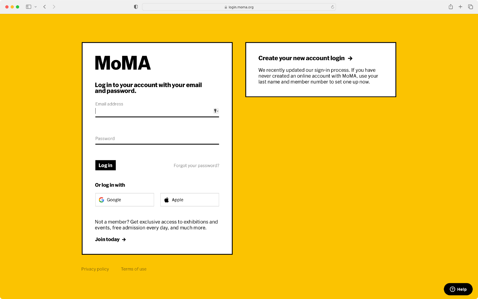
What we found was that the core login and conversion journeys were intuitive, but users often got tripped up on new account creation. Most often, users were mistaking the SSO buttons for Apple and Google pay buttons.
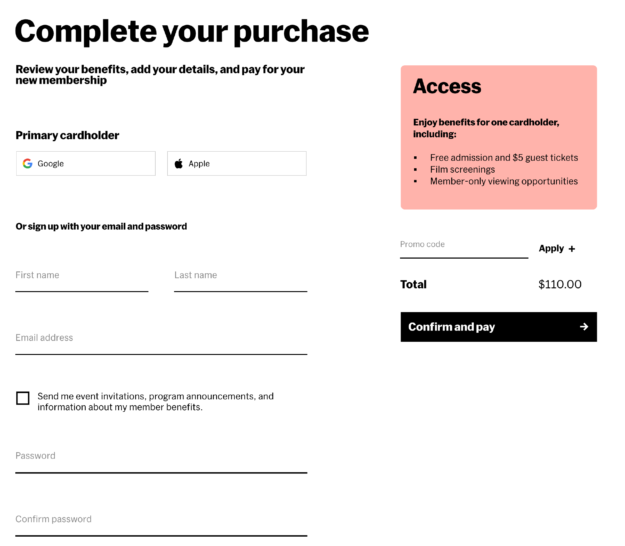
Given that the Membership checkout flow was only one page, and that we wanted to limit our scope, we explored several options ranging from design to copy before settling on a user flow which put account creation first. We emphasizied being able to log in with Google and Apple to also help users prefill other content down the checkout flow.
Our final design for account creation on member checkout
Implementation #
After several rounds of user testing we arrived at a working prototype that I then worked with developers to translate into code. To do this, the IT/Apps team handled backend and front-end implementation on the membership site while I created a Vue app that sat on top of our identity service provider, Auth0.
This Vue implementation was built on our existing atomic CSS infrastructure and handled universal login and password recovery. I also paired with the IT/Apps team to onboard into our atomic CSS infrastructure.
Final login screens for retail, members, and moma.org